bike de boa
Timeline
Roles
Team
Overview
We believe that the bicycle is the future of urban mobility, and that having better bike parkings is a great way of promoting the bike culture in our cities. This project intends to push forward the discussion of what are good bike parkings, at the same time we collect data about the presence and evolution of this kind of structure in the cities of Brazil.
The collaborative aspect allows the active participation of citizens, fostering a positive reinforcement that encourages more people commute with their bikes. On top of that the reviews and our bike parking guide bring information about best practices in a friendly way that educates about safety and encourages better structures to be installed.
This has been a great project to put in practice so many tools and concepts I’ve been learning in the past years about web development, UX Design and Analytics. Working in bike de boa I’ve learned how important it is to go beyond aesthetics and Usability to create a great product. And, most of all, beyond just improving hard skills, this has been a project with a social purpose.
The problem
Most cycling apps at that time seemed to focus too much on routing: how to bike from point A to point B? But how can even the most advanced pathplanning algorithms help you if you happen to live in a city with few to no bike paths and traffic is chaotic and dangerous? This is a cultural problem, and probably no app can fix that. Most of our western cities are car-centric by design, and drivers think they have the streets all to themselves and for their noisy, air-polluting and stress-inducing machines.
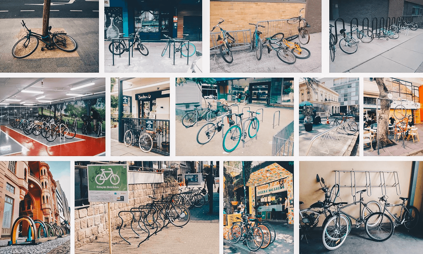
Bike racks, as they call structures to park bicycles, are made to offer confort and safety to ciclists and even work as some kind of subliminar marketing for the daily ciclist. There is even research that say they can boost local economy by increasing customers and sales.
Many places already offered good structures to their clients to park their bikes, but people didn’t seem to know about them. Also there are big misconceptions on what it means to safely park a bike, so there was a big opportunity to reach people and educate them.
Research
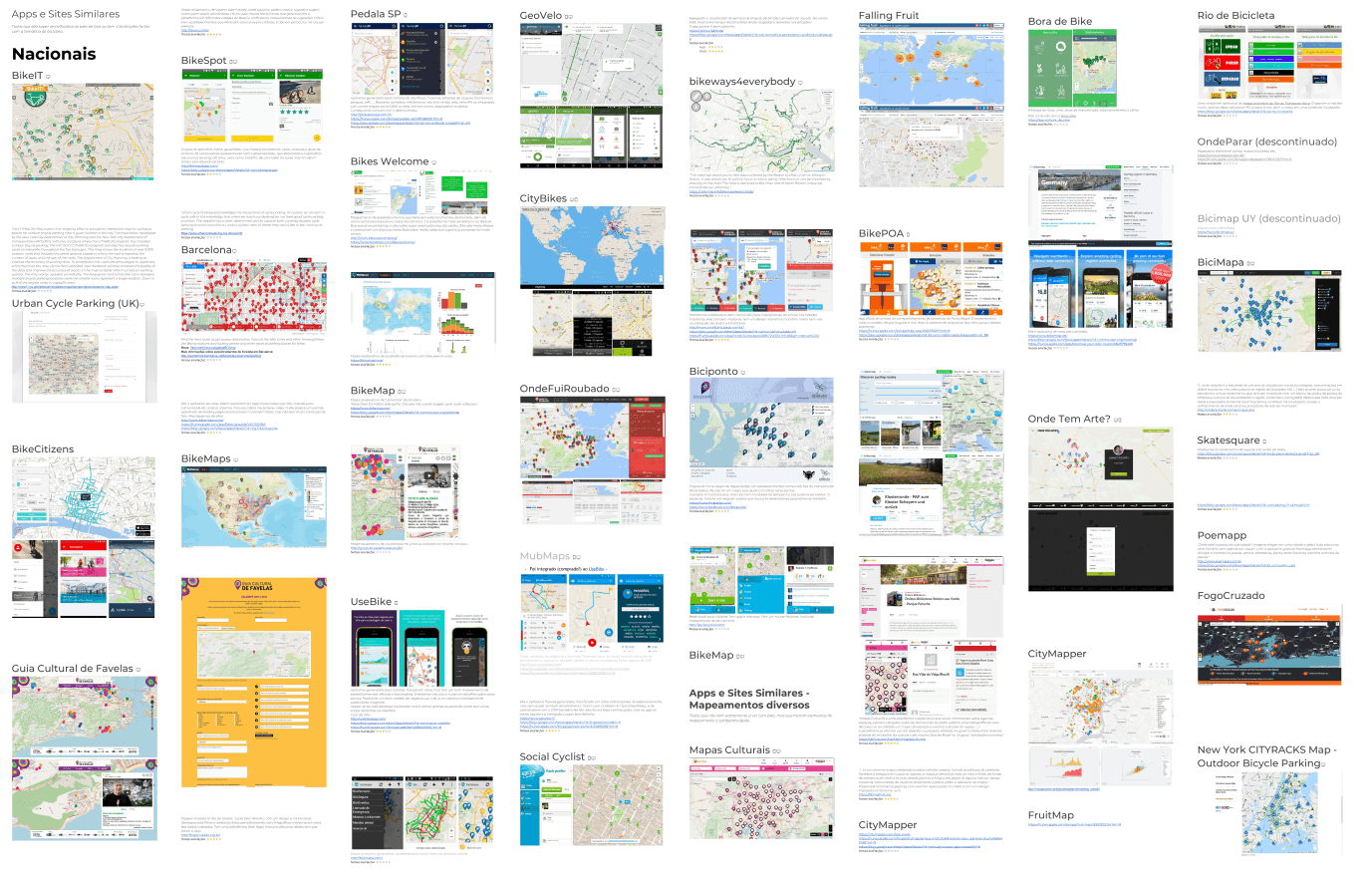
We made a very extensive benchmark study of collaborative maps in Brazil and abroad.
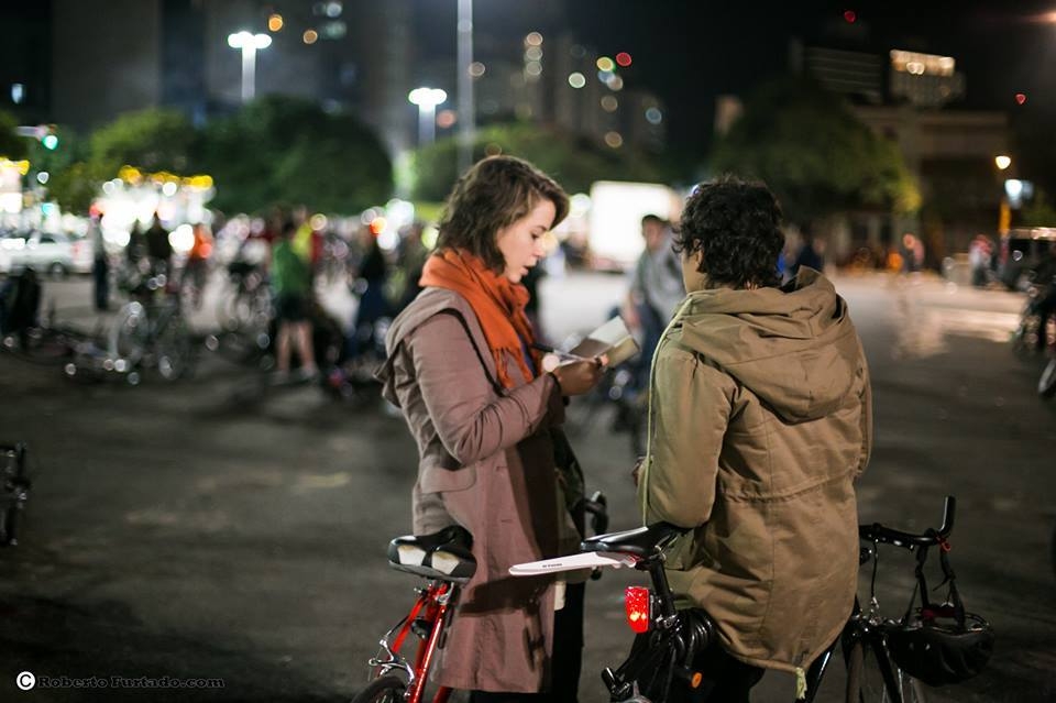
We back all our decisions with user interviews and extensive Desk Research for content on bike safety and urban guidelines from around the world. We started getting really active on online biking communities to reach all kinds of opinions.
The idea of mapping safe places to park wasn’t that new at all. We found out there were actually several collaborative maps throughout Brazil with this objective, which proved many others had also though it was a good idea. However as designers and developers we though we could improve that experience by fixing the issues we found:
- Trust: how can I trust how good are the mapped places? None had a uniform way of ranking the pins.
- Data consistency: each user helping with the mapping gave focus to the attributes they were most interested in, so each pin had very different information than the others. This made really hard to detect patterns in the data, track progress, etc.
- Ease of use: many used Google MyMaps, which is good but there’s a tradeoff when you use a generic map platform for a very specific need. We though we could offer a better experience by building a platform tailored for mapping bike parkings.
- Discoverability and SEO: native apps are not indexed by web search engines, which makes it hard to regular people googling for places to park their bikes.
Execution
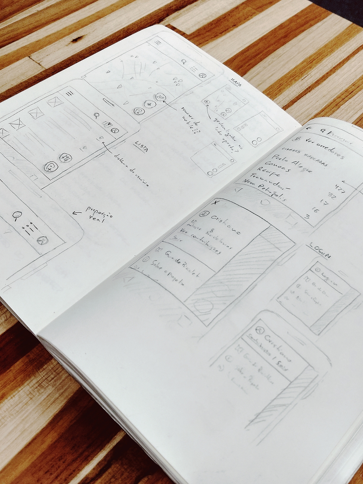
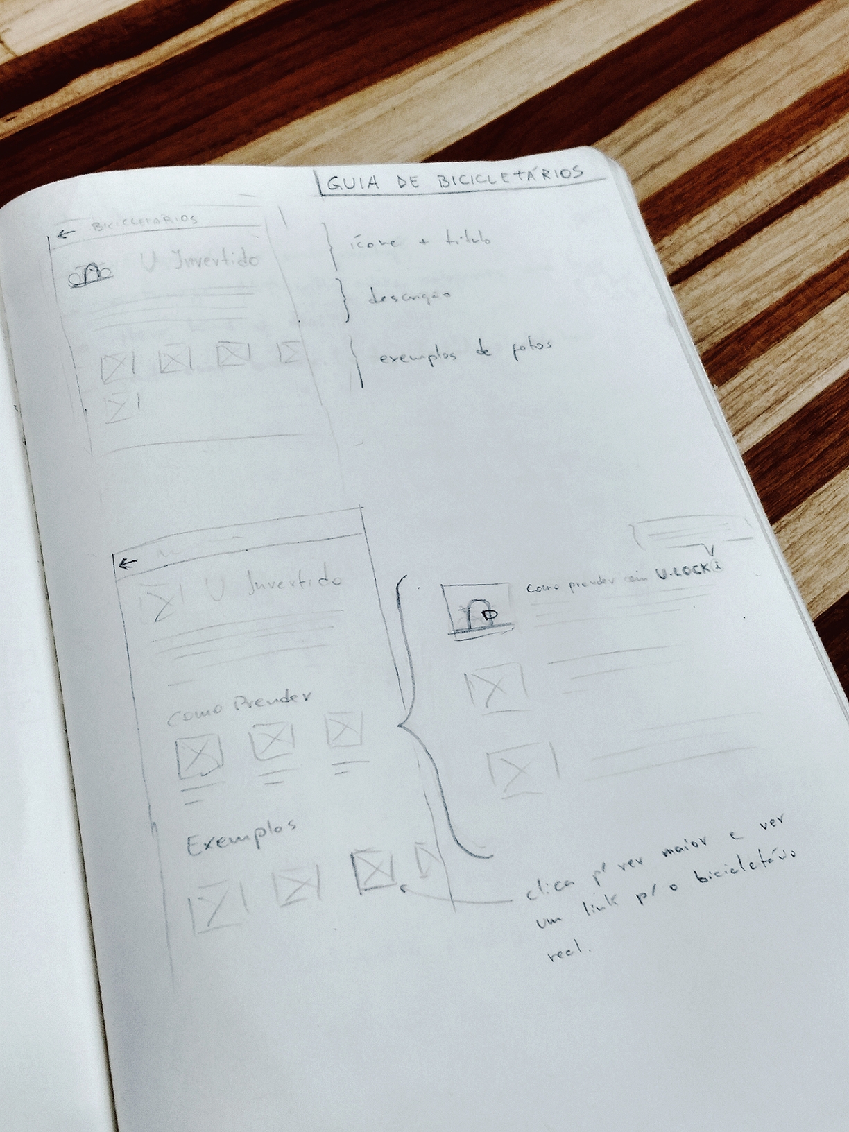
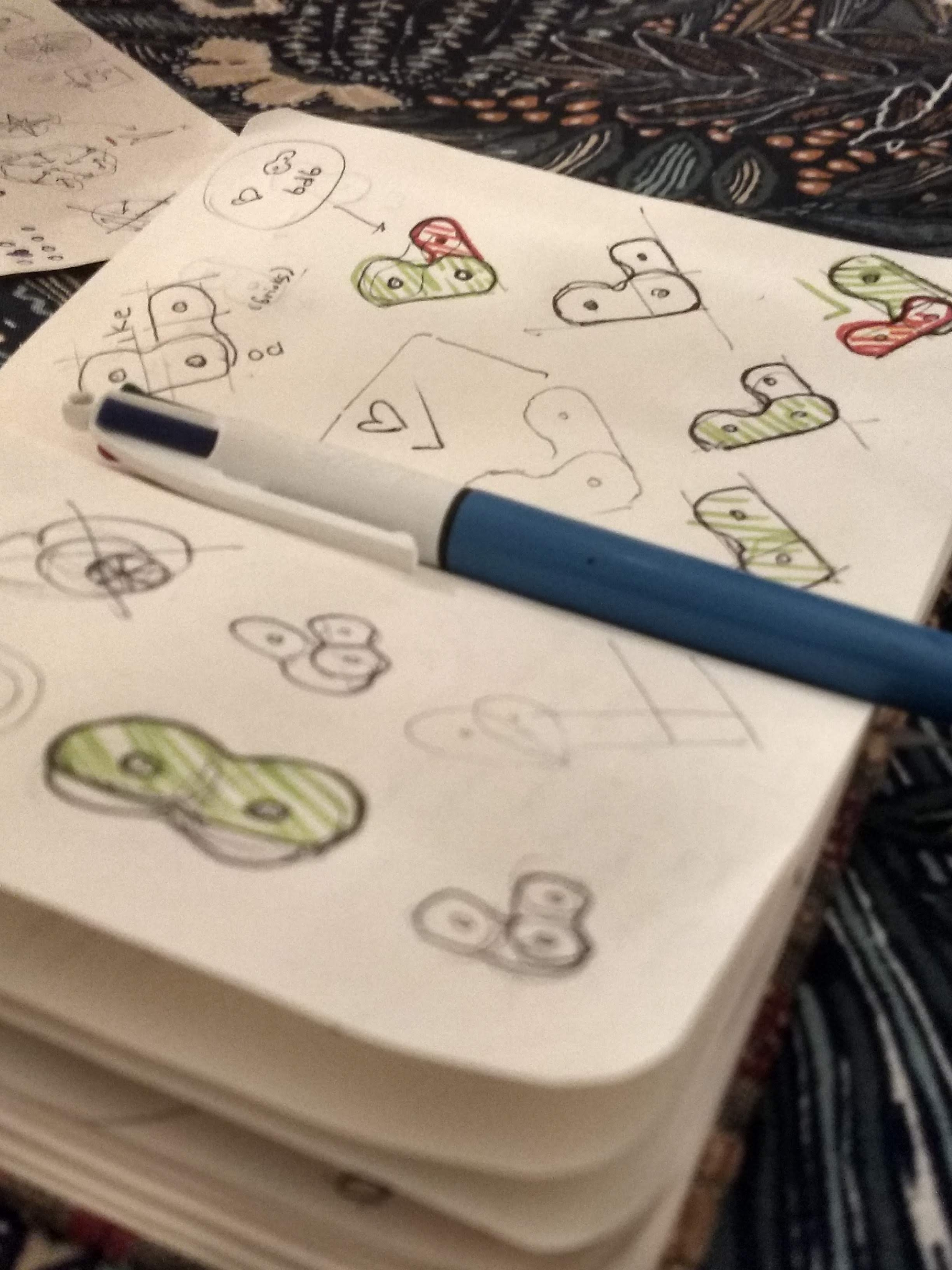
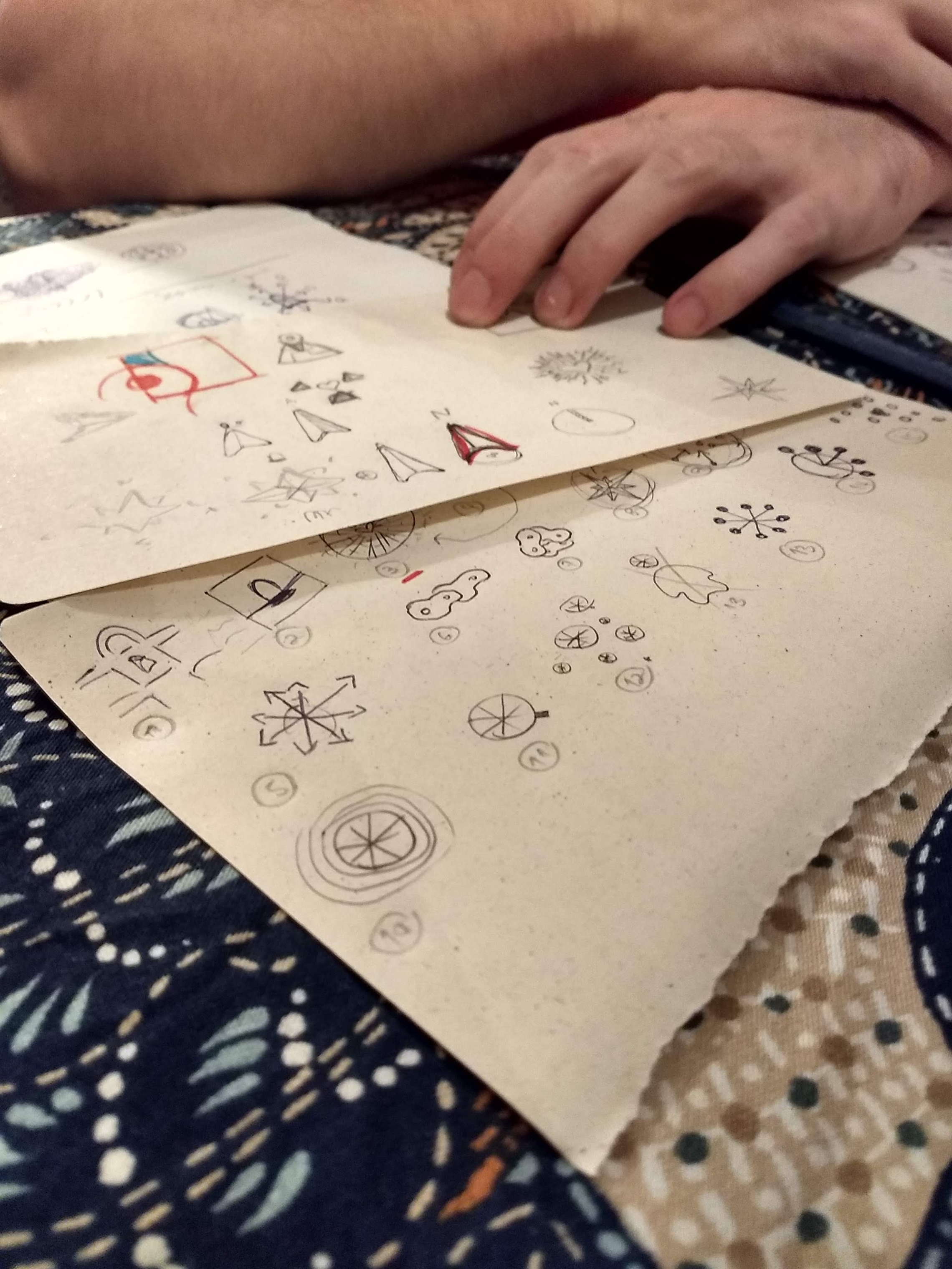
This was my first big digital product and I had just pivoted my career from Web Engineer to UX Designer, so most prototyping was done on paper and then I went directly to code.
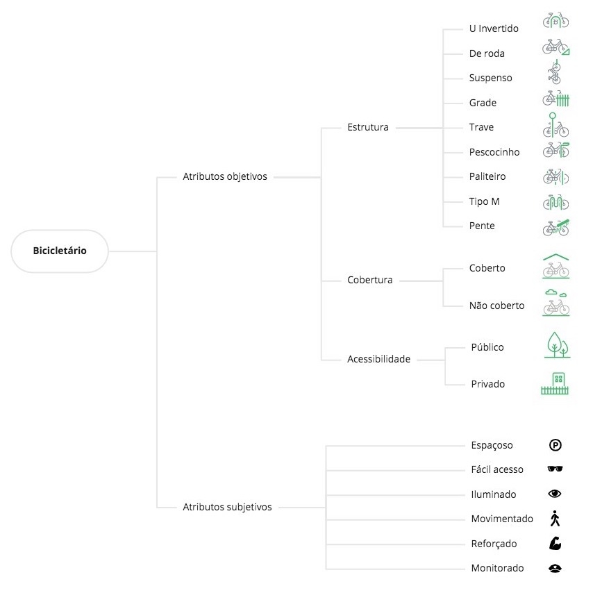
From the research we categorized the different properties related to bike parkings, creating custom icons and illustrations to depict each one. An important distinction we created was between Objective Attributes, which describe the bike rack itself, and Subjective Attributes, which come from user reviews.
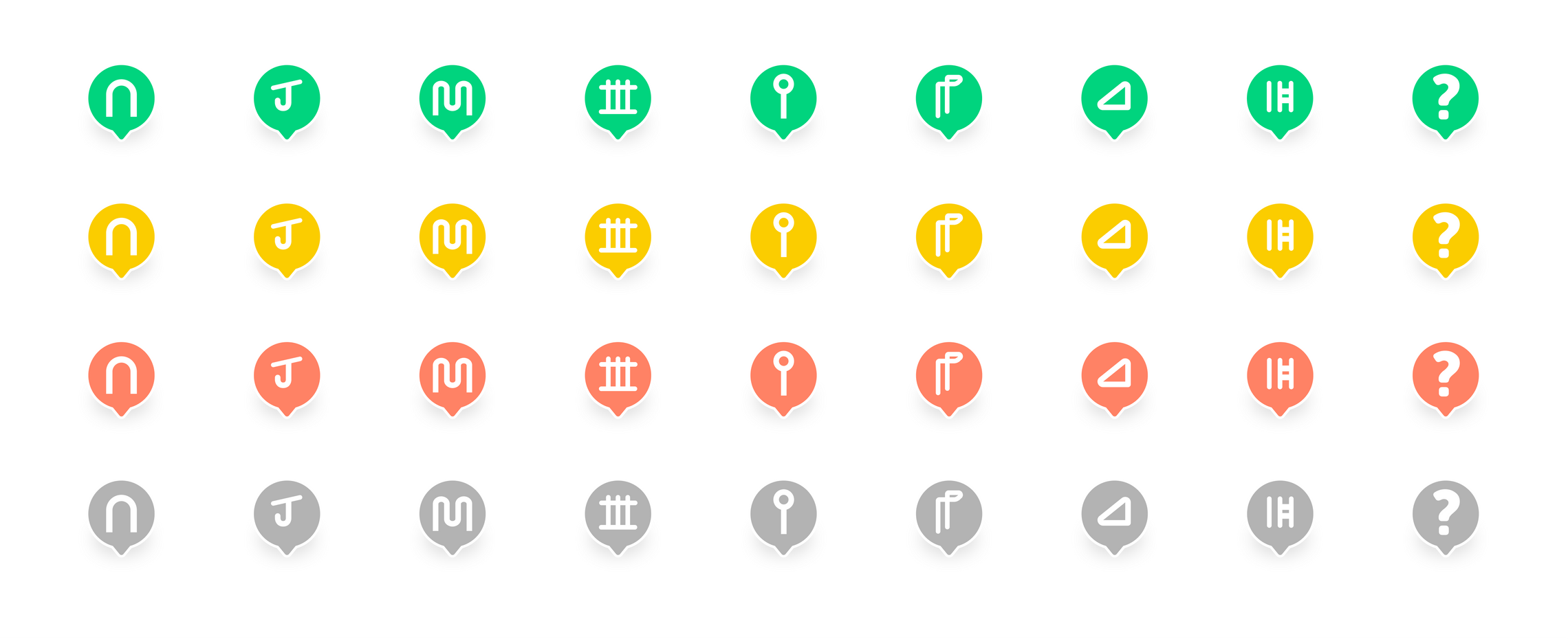
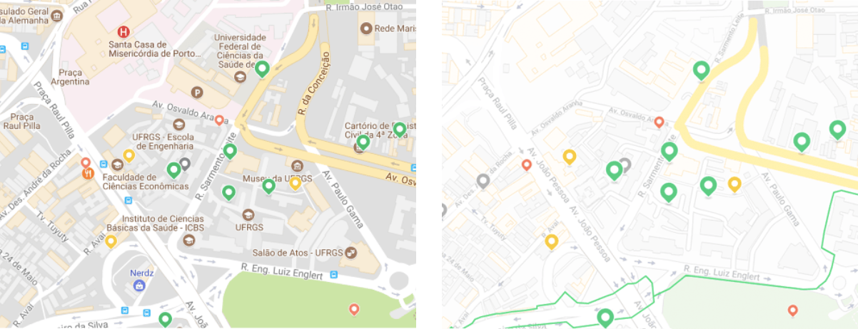
Every bike rack type would have their own reduced icon. The map pin color represents the average rating users have given to that bike rack.
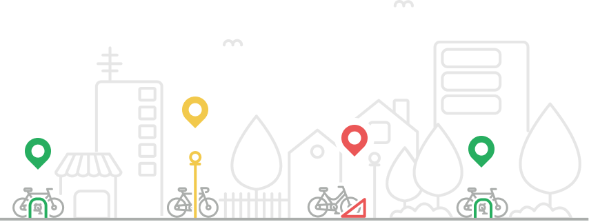
We played with some decorative illustrations as well to use on social media.
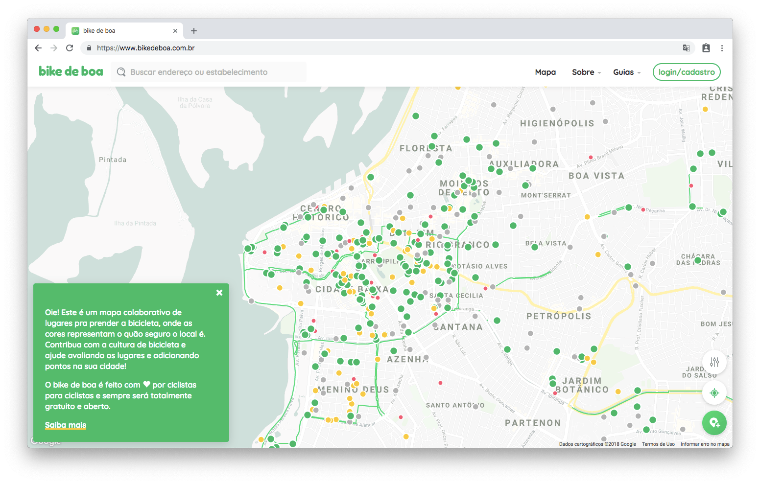
Leveraging the flexibility of Google Maps we customized everything in the map, filtering out the noise, keeping the essential and fine-tuning colors to match the project visual identity.
Our hypothesis was that the main use of the app would be on Mobile, with the user in the streets either looking for a safe place to park or trying to map and review some place he/she found. This led us to use a mobile-first strategy, both for UX and Front-end development, making sure this was the main touchpoint we invested our energies. Although we used web technologies and PWA, ultimately we managed to get it into Google Play Store.
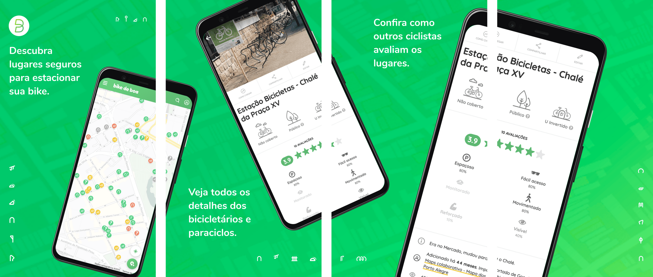
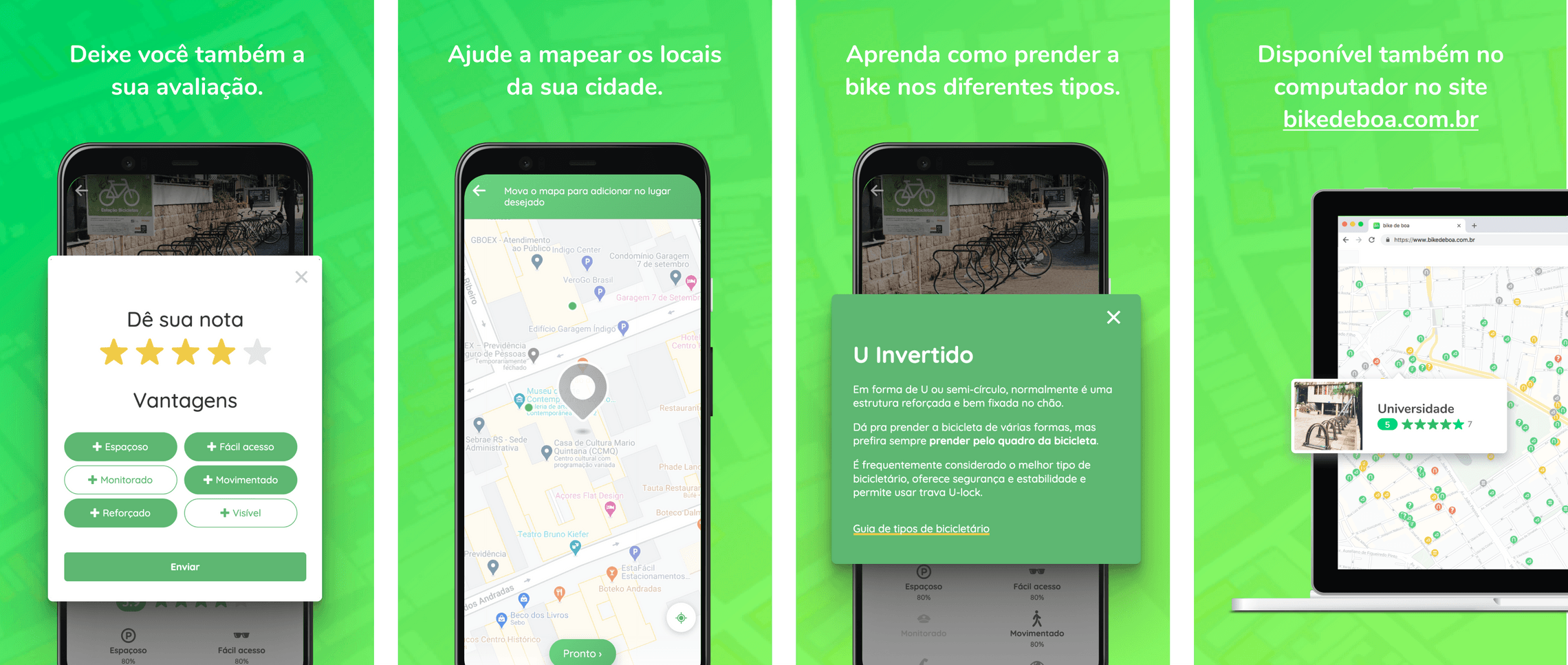
The Play Store screenshots section is a great place to sell the main product’s value propositions:
- Find safe places to park your bike
- See all details of the bike racks
- Take a look how other cyclists rated the places
- Leave your review as well
- Help mapping places on your town
- Learn how to lock your bike on different bike rack types
- Available also through the website
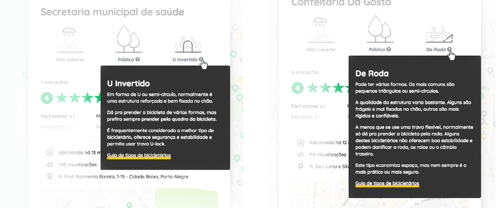
Education is an important part of this project. Concepts like the types of bike racks are explained in more details with contextualized tooltips.
Development
Building native apps, although they offer the best performance, are very cost-intensive. Using web technologies we found a way to have one single code base while offering a cross-platform and cross-device experience. An emerging technology called PWA caught our attention as a way to bridge the native app experience with the accessibility of the Web.
We use web technology because it’s the most democratic platform ever. We’ve been using modern tools and concepts like Progressive Web Apps to offer great experiences from low-end to high-end Mobile and Desktop devices while still being free of friction.
Since then dozens of people have passed by this project, contributing as they could. As part of a small group of contributors I was responsible for a little bit of everything. Most of the time however has been invested in the UX research and design and front-end development.
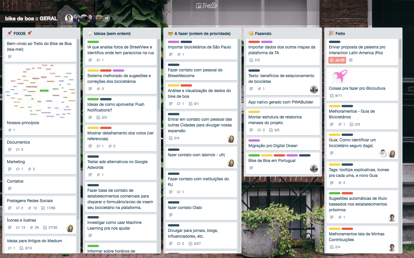
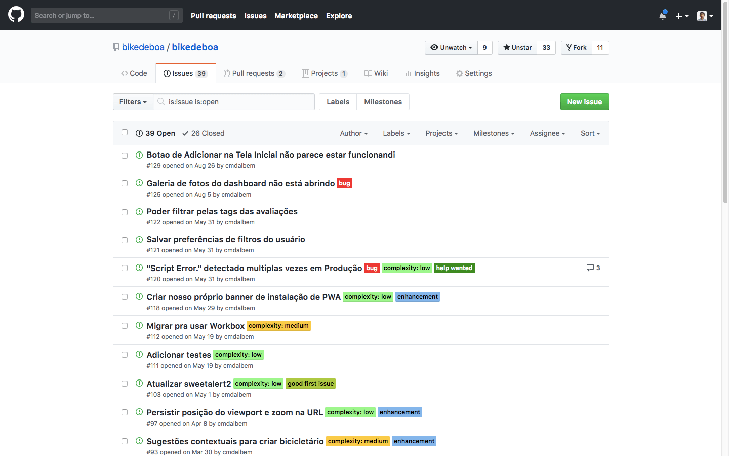
Using simple project management and communication tools such as Trello, GitHub and Slack proved to be essential to enable so many people to contribute asynchronously. Making this project Open Source was also a natural choice.
Final product
The user experience is focused on exploring the map. Colored pins show where the mapped bike racks are and how they’ve been rated by other users. Hovering on pins shows some basic info, while clicking on it opens a modal with the full detailed view of that place.
Since places have attributes and tags you can use filters to chose the kind of places you prefer. Are you looking only for well reviewed, public, u-racks that are covered from the sun and rain? No problem, here are the results.
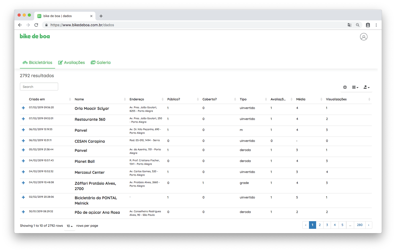
Like our source code all the project data is also open. I built a Data Platform for users to easily browser, search and filter through data. Using our data for research or other applications is as easy as clicking the download button, which exports all our data in convenient file format such as CSV or XLS.
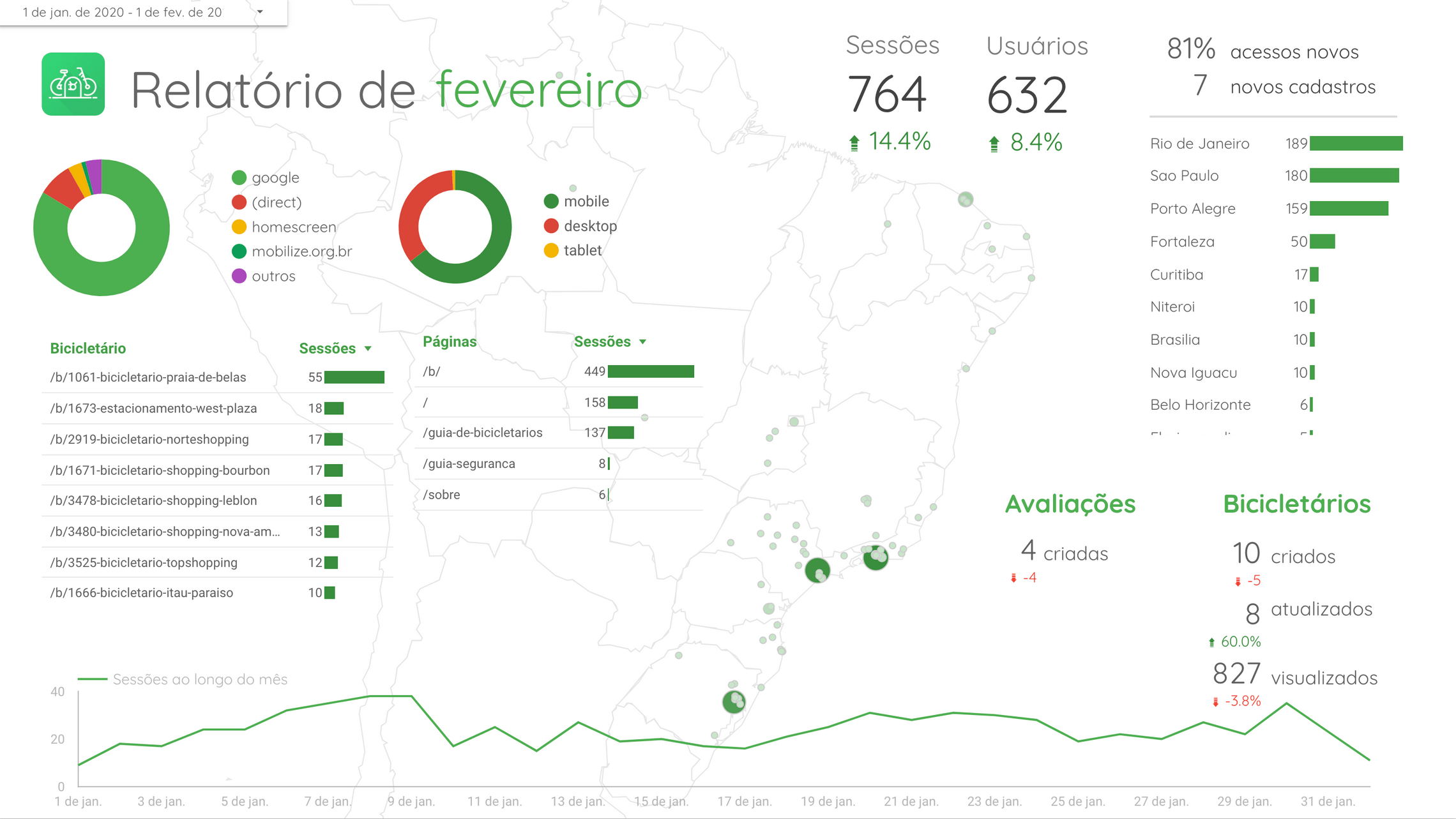
To monitor the product metrics I created a dashboard on Google Data Studio, which is automatically synced with our Google Analytics and shows the most important data about any given month activity on the platform.
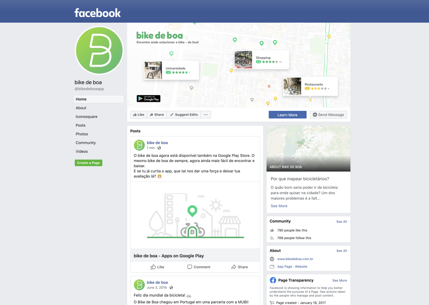
We made some effort to have a good social media presence as well, both on Facebook and Instagram. Digital Marketing was not the expertise of any of us in the team, so there was a steep learning curve.
Results
We’re very happy that all the work had results! We’ve managed to burst the bubble and expand to all the country, and the engagement numbers are quite good for a project with zero marketing budget.
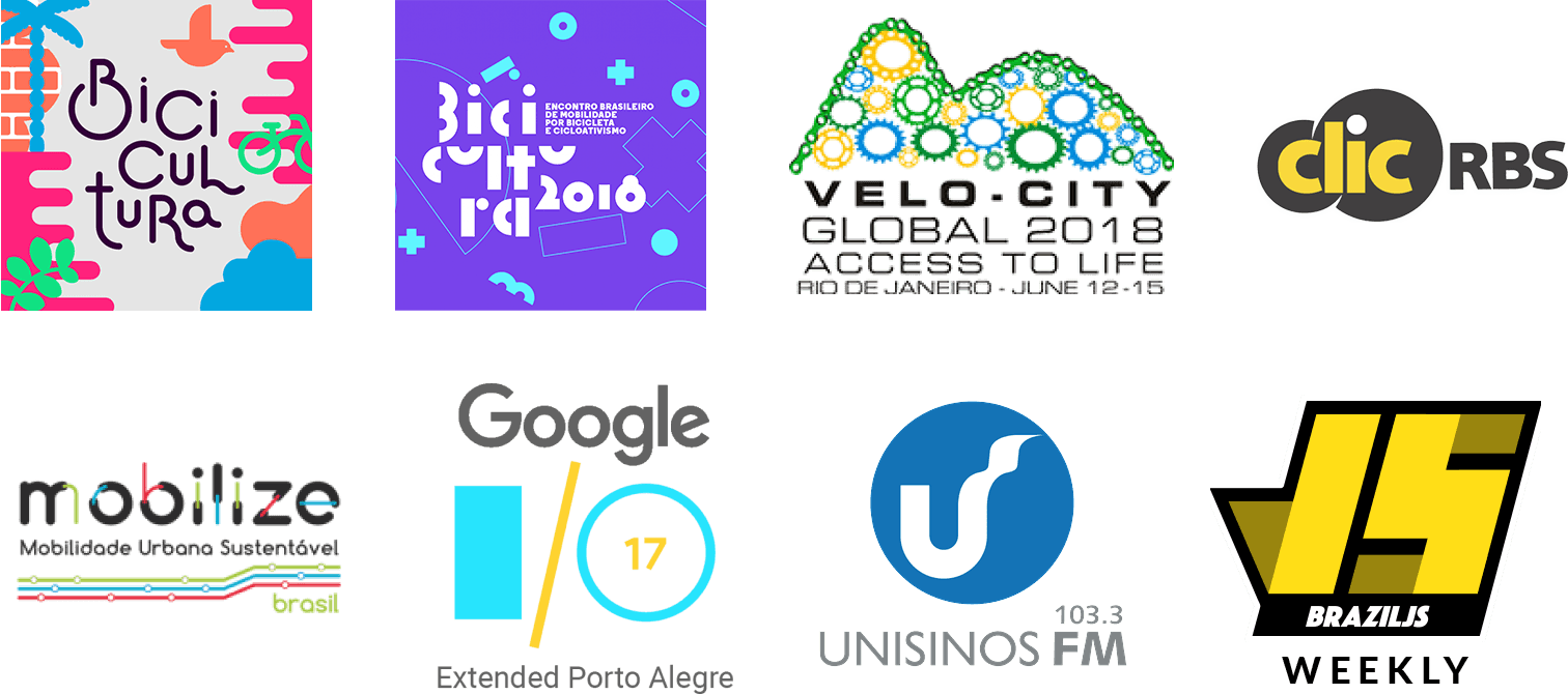
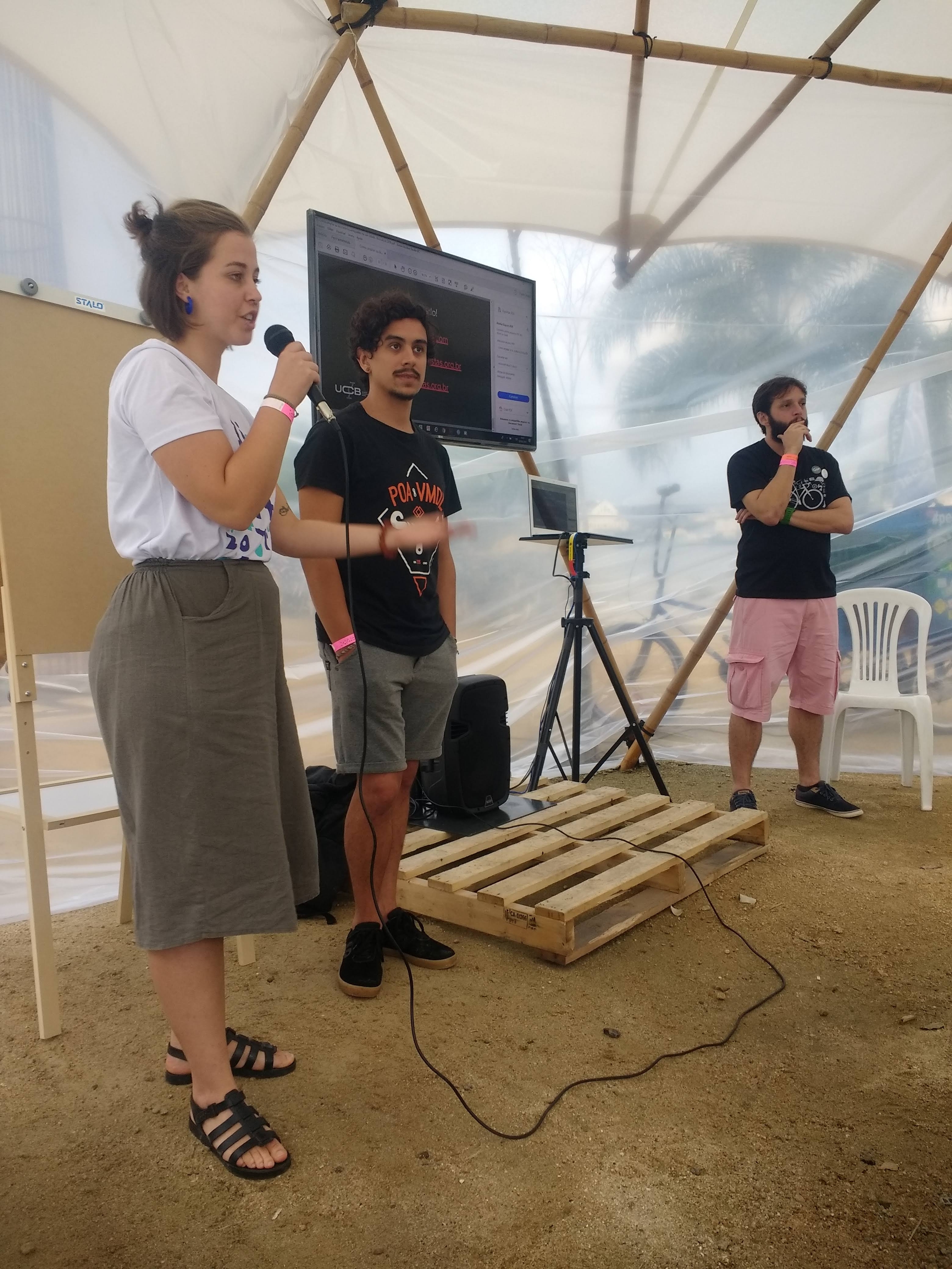
We also were featured in some cool places: cicloactivist and technology conferences, blogs, podcasts, newsletters and the local press.
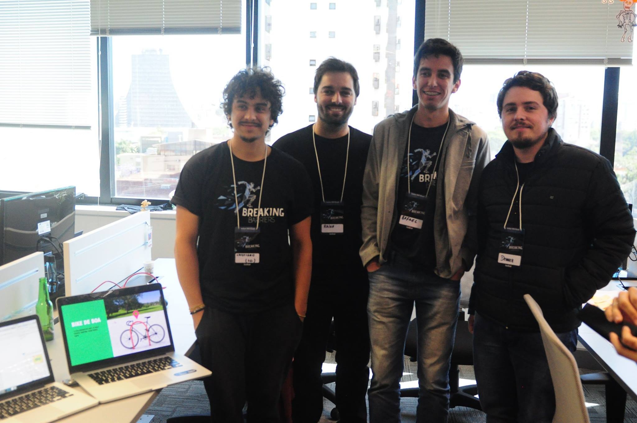
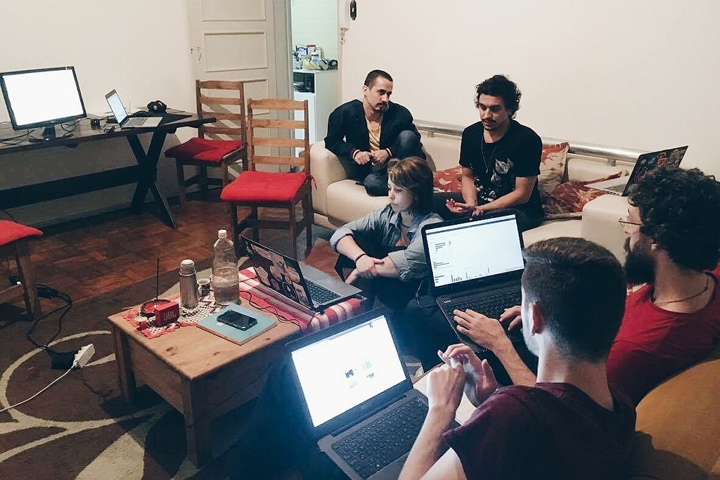
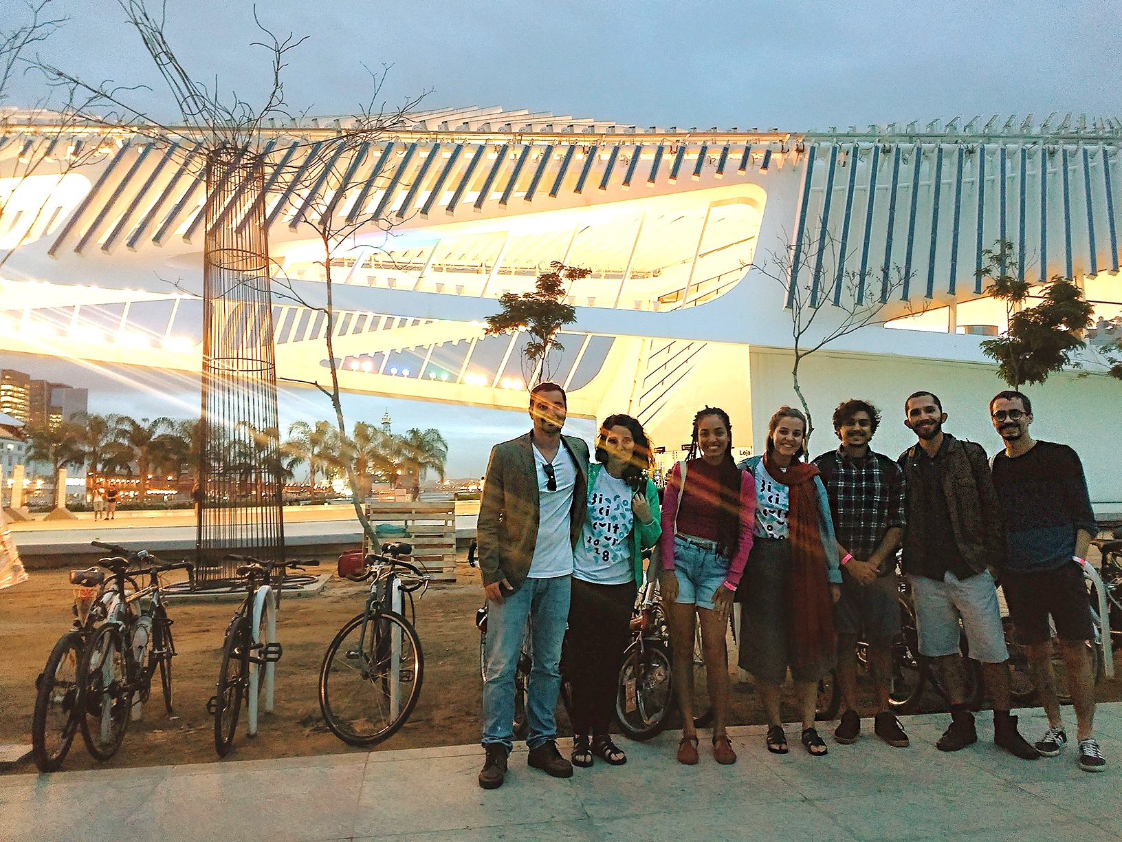
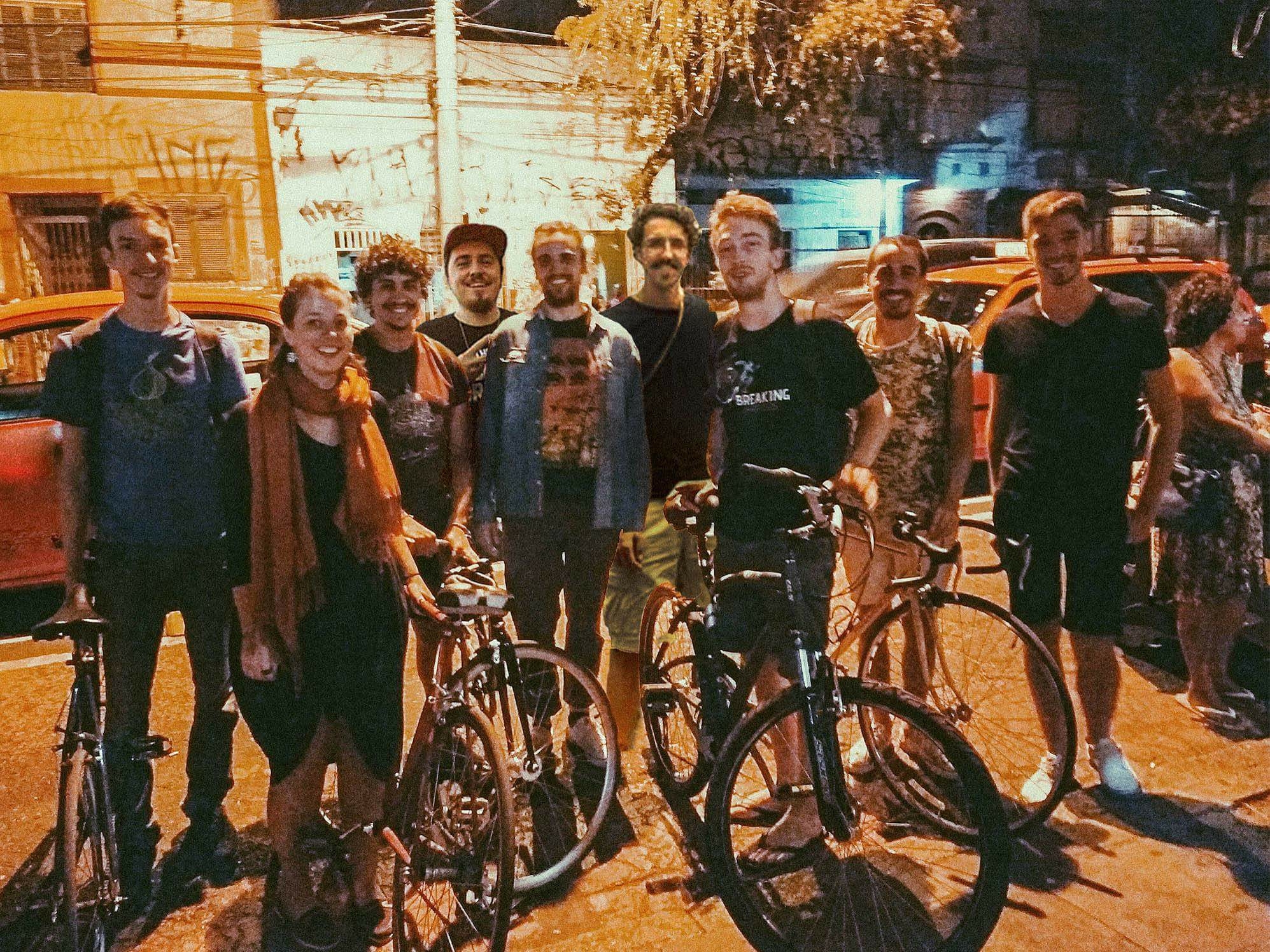
Cool pictures of our team
See more
"Computers are like a bicycle for the mind."
