Escapista
Timeline
Roles
Team
Metrics
Overview
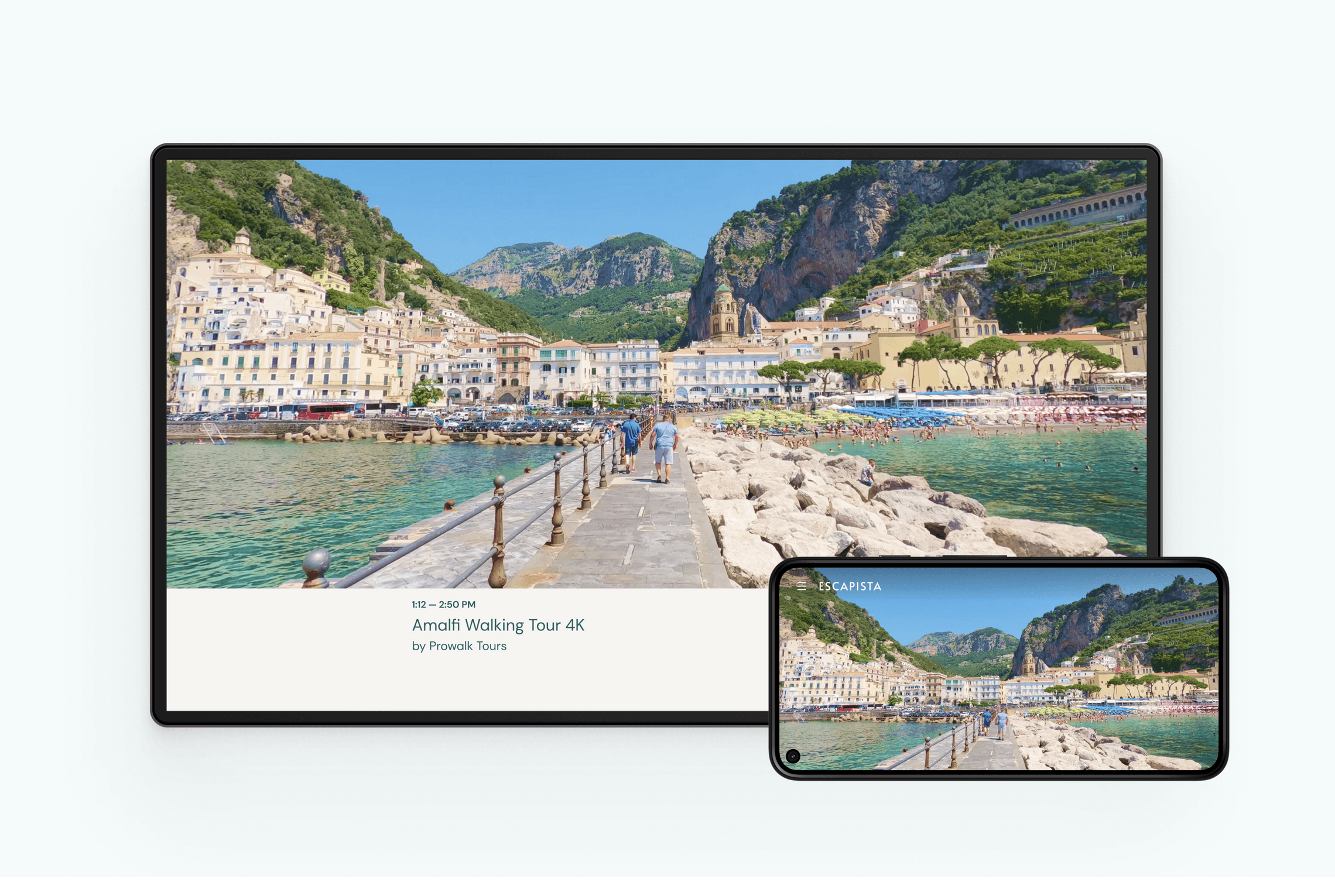
For a long time I’ve been in love with the concept of Slow TV, and from the beginning of the COVID pandemic I started collecting some YouTube channels I was shocked with how much amazing stuff was out there. I started sketching ideas for a webapp that would help promote all this amazing content, something with a frictionless experience that would attempt to fix once and for all the choice paralysis present in so many video streaming platforms these days.
From a survey we ran in the Reddit Slow TV community, I focused on designing an experience that would be calming, “playing to the affective experience of watching Slow TV itself”. I draw inspiration from Scandinavian design, birthplace of the original Slow TV shows, and Japanese culture, both well-known for its minimalism and contemplative natures.
Research
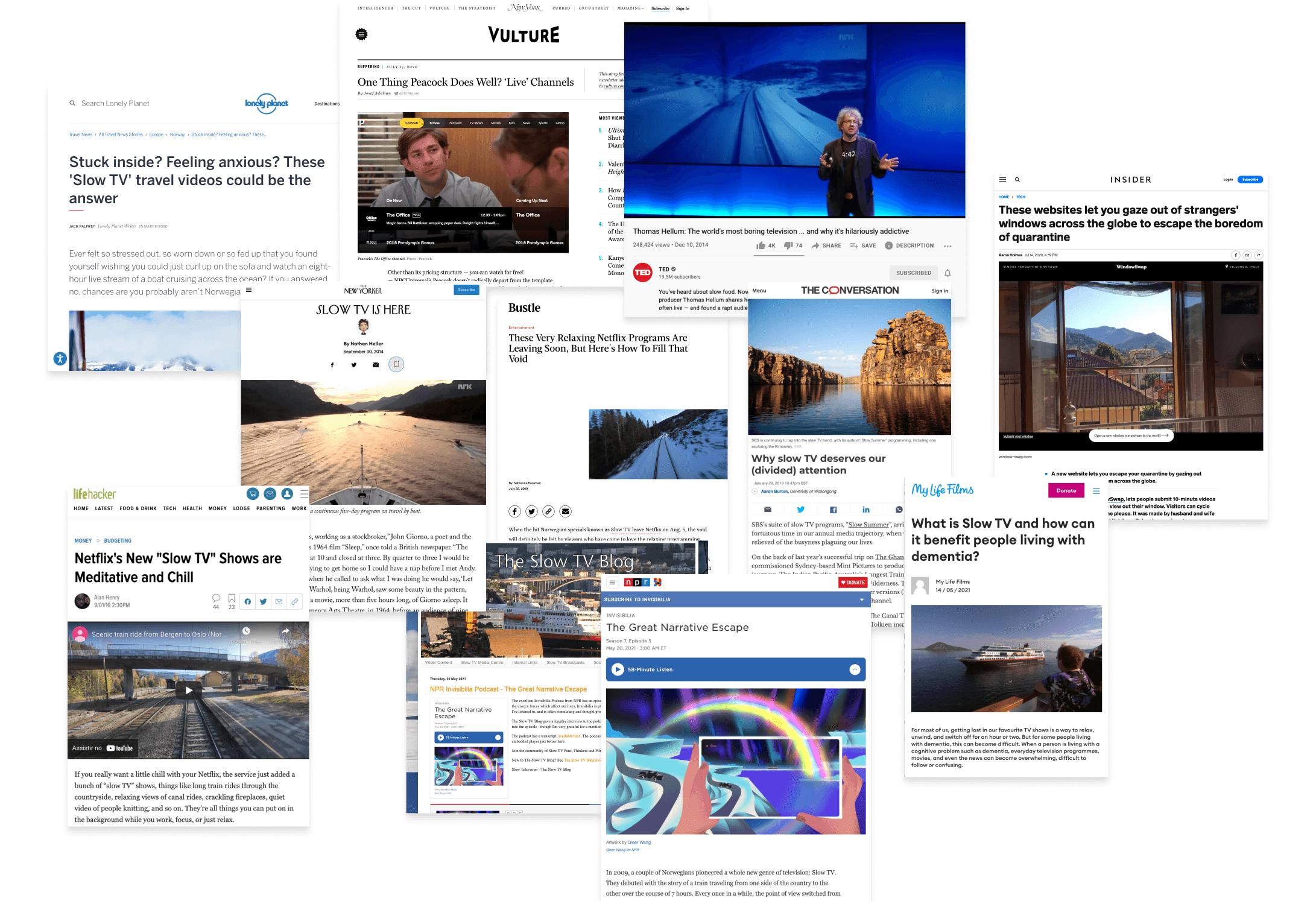
Our research started diving into the topics of Slow TV, reading all articles, watching all talks and listening to all podcasts we could find on the subject. We also read a lot also current trends for online streaming and a growing trend on transcending the algorithms and bringing human curation back.
We also learned there’s also a growing discussion about “the Netflix effect”, a frustrating experience of “analysis paralysis” that affects video platforms as well as other products that offer too many options to the user.
Learning from the community
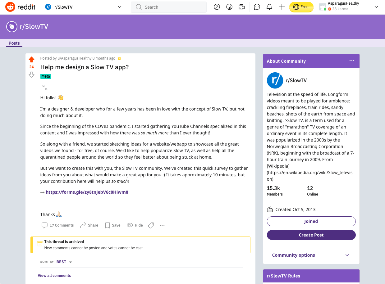
This project was co-created with the Reddit Slow TV community, where we understood the whys and hows of those users. We posted a survey asking people to help me build this app.
Designing in the open
After analysing these responses we made sure to post again on the community thanking for the interest and the great feedback, sharing a small report of the main findings.
Main learnings
Why people watch Slow TV
How people watch
What viewers want in a platform
Content and categorization
Viewing experience
Asking for permission, not forgiveness
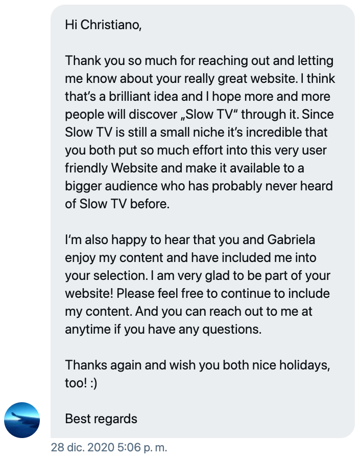
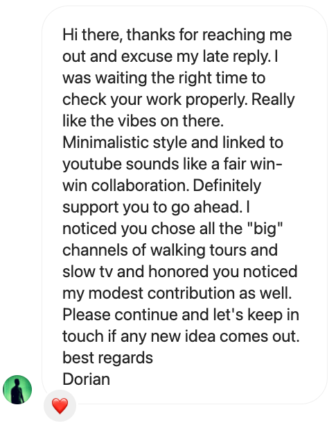
Finally, we also reached out to our favorite YouTube creators to see what they think. While we didn’t get responses from many, everyone that replied was very positive about the idea and some even very excited and thankful, such as Japan Potato and Chill & Explore:
Visual identity
Inspiration
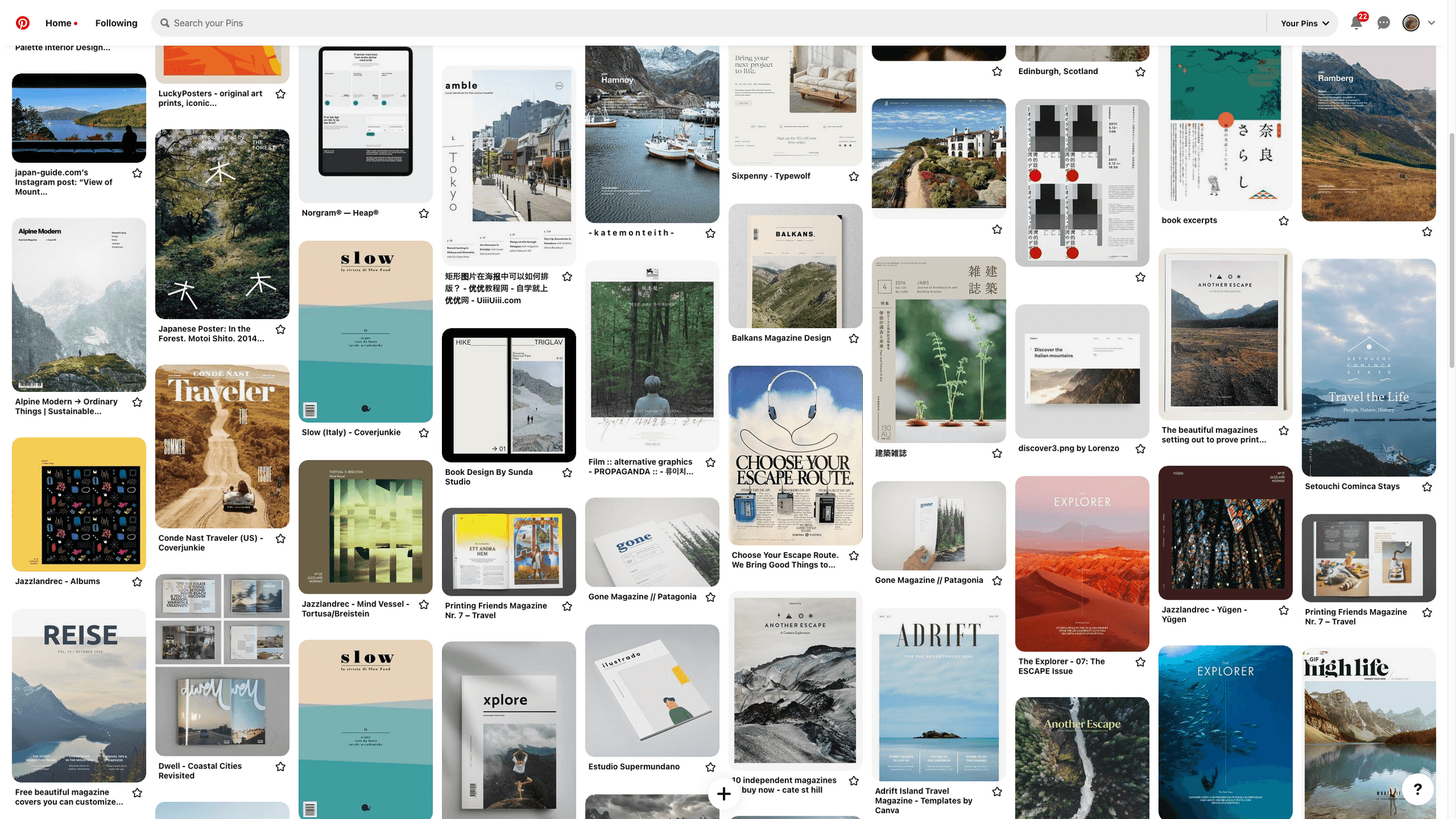
I drew inspiration from an overlap between Scandinavian design and adventure magazines. Scandinavia is the birthplace of the original Slow TV shows, and I’ve learned they have a design tradition of minimalism, subdued colors, geometric typography and high usage of photography laid out in asymmetric grids.
Logo and illustrations
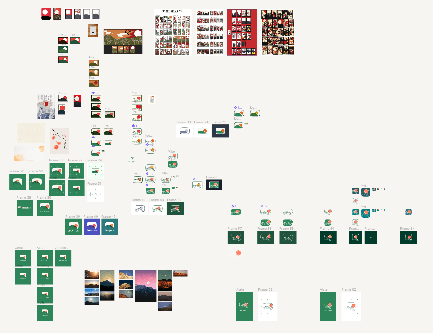
I drew inspiration from Hanafuda, traditional Japanese cards. As the Scandinavians, Japanese culture is also very centered on nature and contemplation. One that particularly caught my attention was the Full Moon card, which depicts beautiful natural scenery with a big full moon that seems ambiguously seems to be hiding or being revealed from behind a hill.
I really felt this expressed my feeling of being stuck at home, wanting to go out but at the same time trying to take care of me and others.
The illustration would also be explored with a fun and engaging parallax effect in the landing page.
I also have fun with the concept in this message that appears on mobile if you’re holding the device in portrait mode.
Prototyping
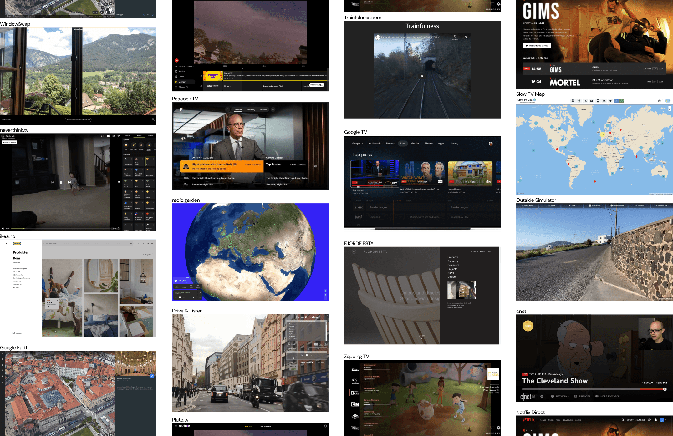
To kick off exploring UI solutions we did some benchmarks, looking for similar immersive web experiences and TV UI references. This was particularly important since it was my first time designing such kind of product.
Design principles
I’ve explored many alternatives, searching for something that made sense to our vision of a UI that “play to the same affective experience of watching Slow TV itself”, as one survey respondent said. To guide my explorations and help us make decisions, I devised 3 design principles for the product:
-
Minimalism as a way for calm and focus
-
Immersive meditation
-
Less controls, more contemplation
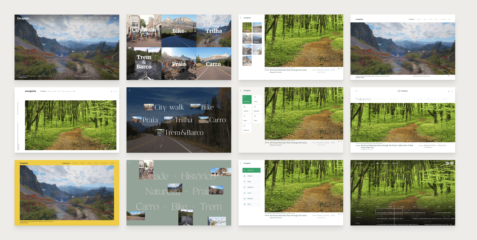
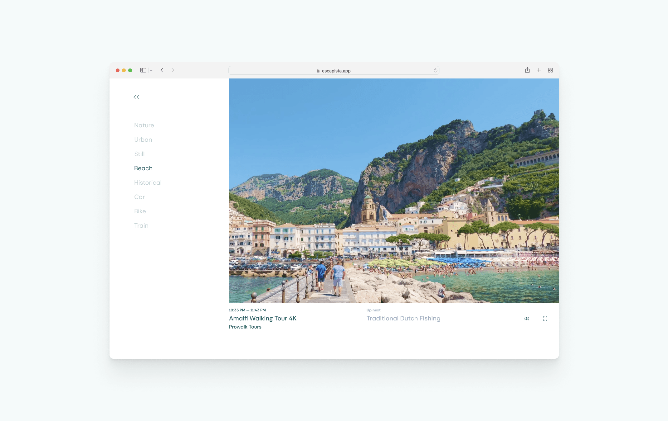
The bottom bar component was one that I painstakingly explored, trying to find the perfect balance of useful information about the schedule without damaging the extremely minimalistic visuals.
Finding the essential
For the final version I ended up removing several details normally found in video players so I could focus on the bare essentials. The “up next” section, for example, will only appear if the current video is about to end in a few minutes, otherwise it’s hidden too.
Fine-tuning motion
For my favorite concepts ones I created simple prototypes to see it in action and get feedback from users. At that time Figma didn’t support videos, but by converting some short Slow TV clips to GIFs I managed to create fairly realistic prototypes.
A landing page to tell a story
Based on the main questions brought from user tests, I designed a landing page that presented the concepts of the project. I wanted to bring more clarity to some of our philosophies that guided our UX decisions, for example explaining why there isn’t pause of fast-forward buttons.
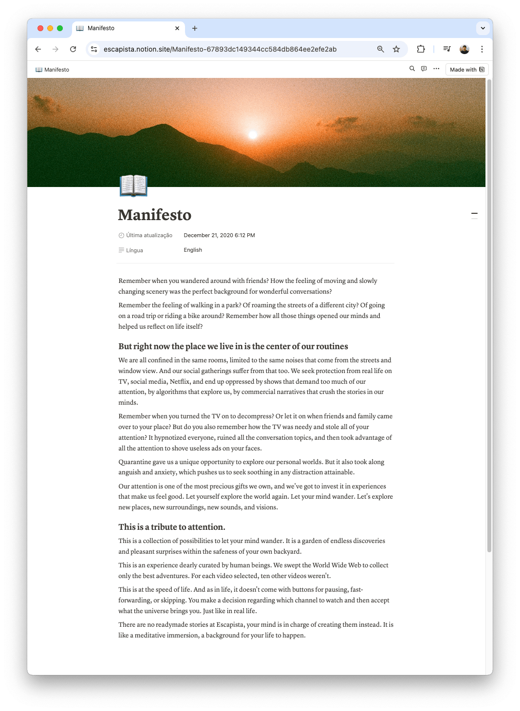
As an artistic project with a strong set of values I though it was the perfect occasion to put some writing skills to test and try to summarize everything we wanted this project to mean into a manifesto, that is accessible from the landing page.
Implementation
The first proof of concept was a very rough prototype made in Glitch.com, a fun little sandbox tool. After some tweaking and seeing the general idea worked, I started scaffolding a proper webapp stack around it.
The tech stack
I started creating an integration with Airtable, which would serve as both our Database and CMS (content management system). By using a YouTube Embedded Player under the hood I could simplify any complexity about storing and streaming videos, but also all views and ad revenue would to the original video creators. For layout and styling I used Tailwind CSS, a framework with an innovative approach that I’ve been meaning to try for a while.
Building a CMS
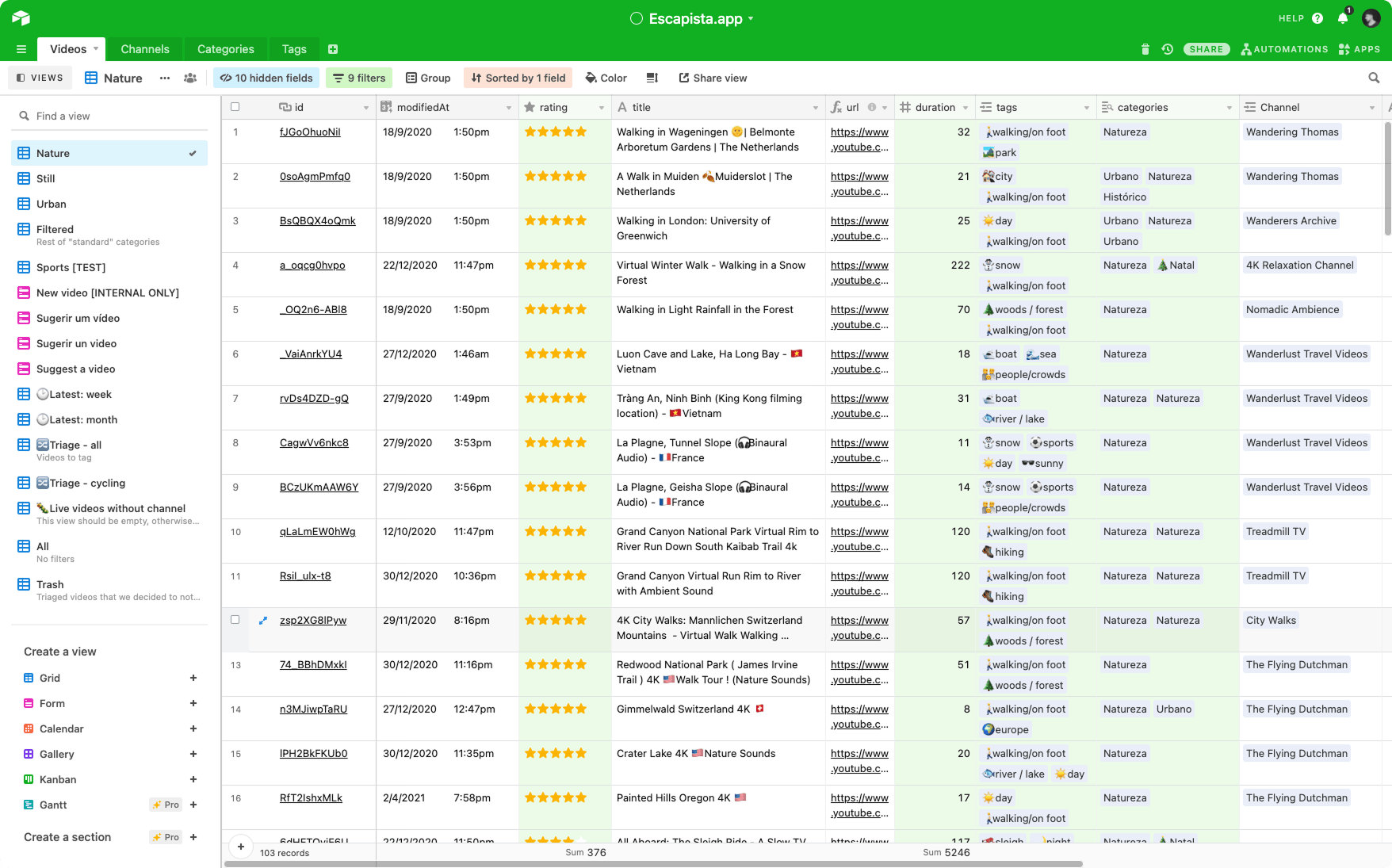
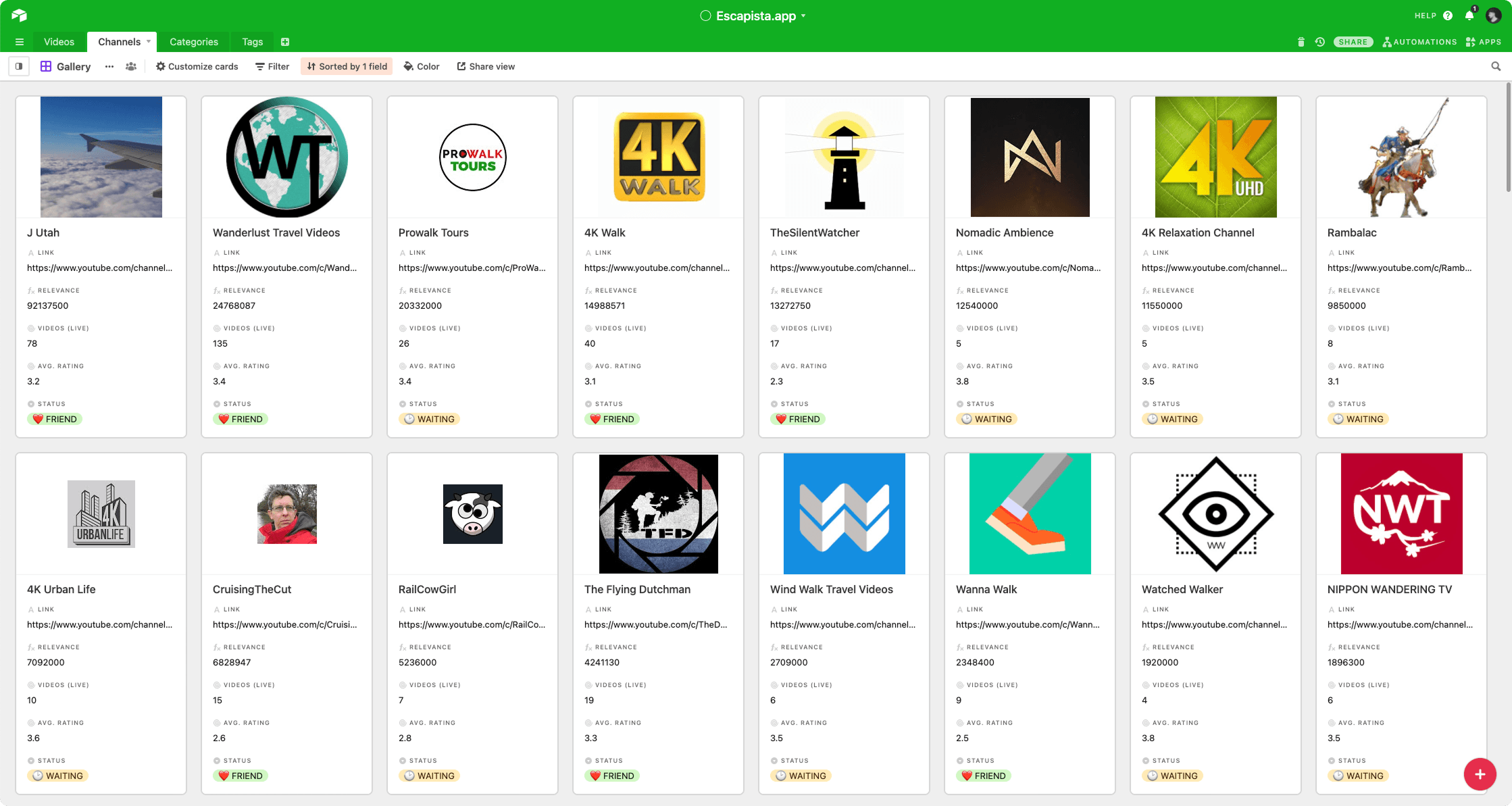
A lot of my focus on the development side was on creating a Content Management System (CMS) for storing, rating and categorizing the videos. This was crucial since the experience was so simple, the curation should be of the highest quality, and we’d invest many and many hours on searching and categorizing the best videos we could find. I chose to use Airtable for the power it provides, enabling to create relationships between data just like a real database, while providing an extremely user-friendly interface.
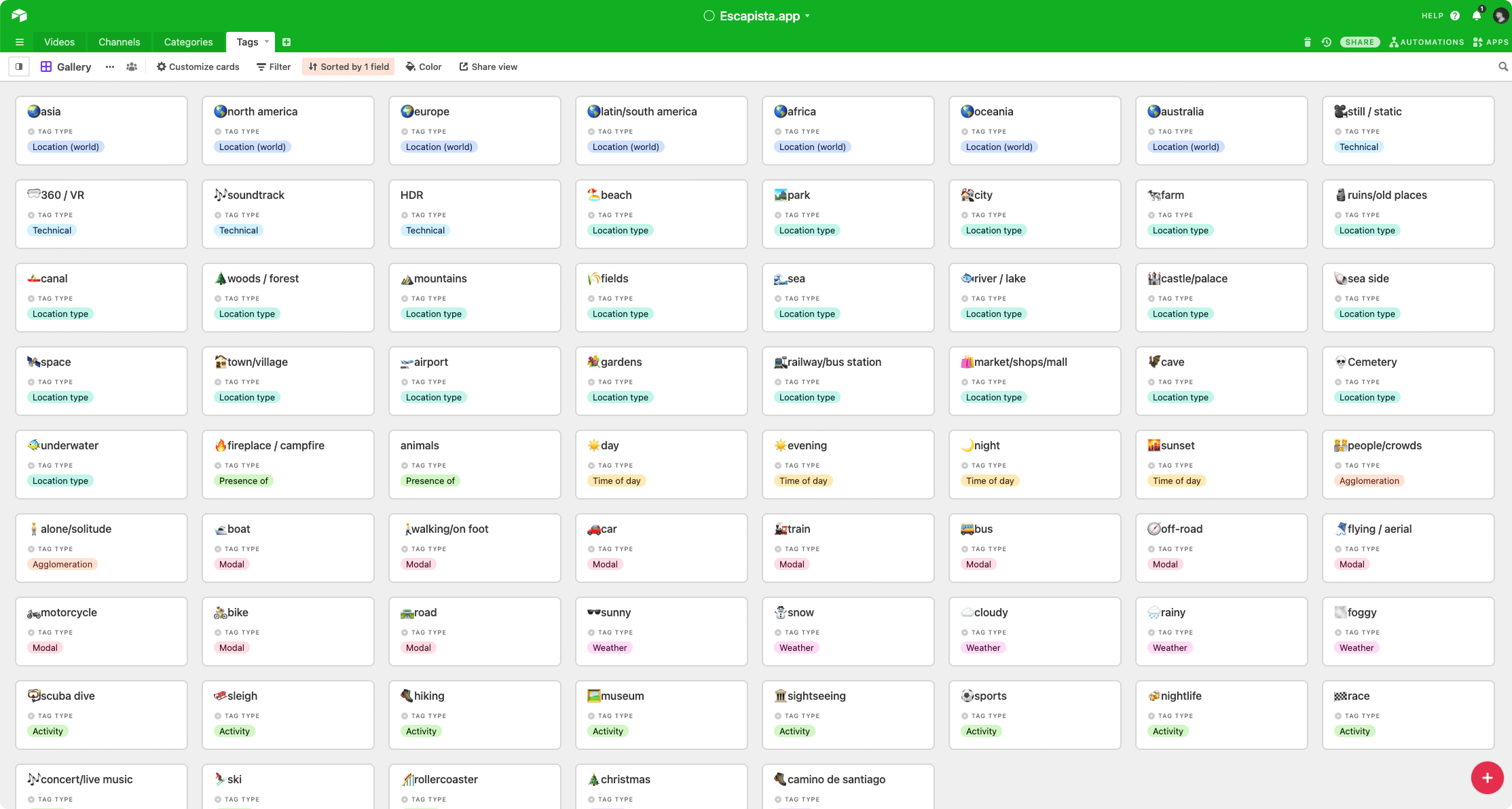
The database is comprised of mainly 3 entities: Videos, Channels and Tags, all which can be edited separately and are linked like a regular database. This is then connected to the website backend, which retrieves, processes and caches this data and build the video “scheduling”.
A simple yet flexible tagging system
We created a flexible tag system that allowed us to classify the videos on some main dimensions independently of how the website would organize them. At this point we knew we wanted to have just a few channels, but we didn’t know which would be.
The broadcast schedule algorithm
Even though the channels’ schedules are live, just like in a regular TV channel, there’s no real syncing mechanism in the background. I’ve developed a simple algorithm that runs in the client and that uses the computer clock (which is automatically synced by the Operational System) as a index for videos. This enables anyone sharing the link with a friend or family member to watch the same video, provided they’re at the same timezone, while doing a call for example.
Launching and monitoring
Launch plan
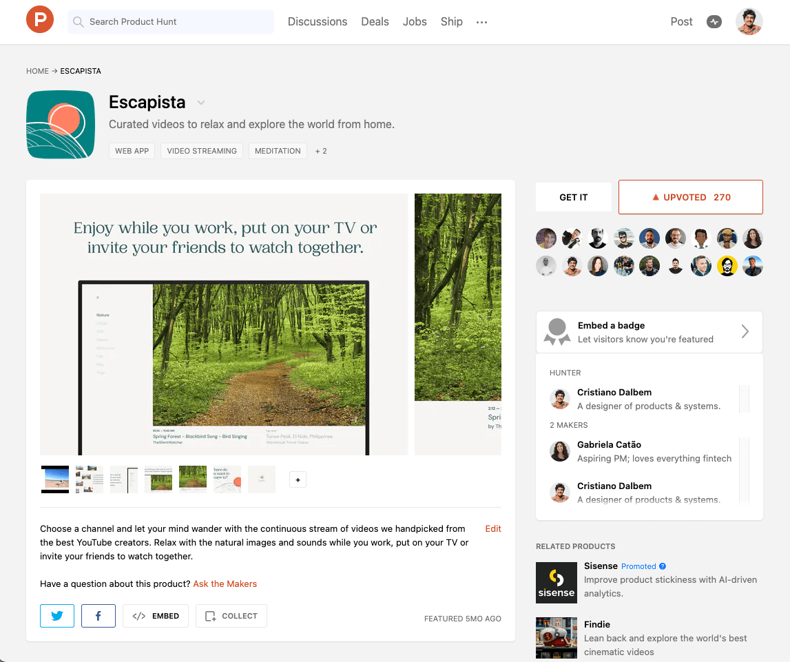
We created a launch plan including the original Reddit community, our personal social media accounts but also a big launch on ProductHunt, one of the biggest communities for tech products. We were very happy with the result, accumulating more than 270 upvotes and ending up in the top ranked launches for the week and gaining lots of organic traction from posterior blog posts.
Measuring what matters
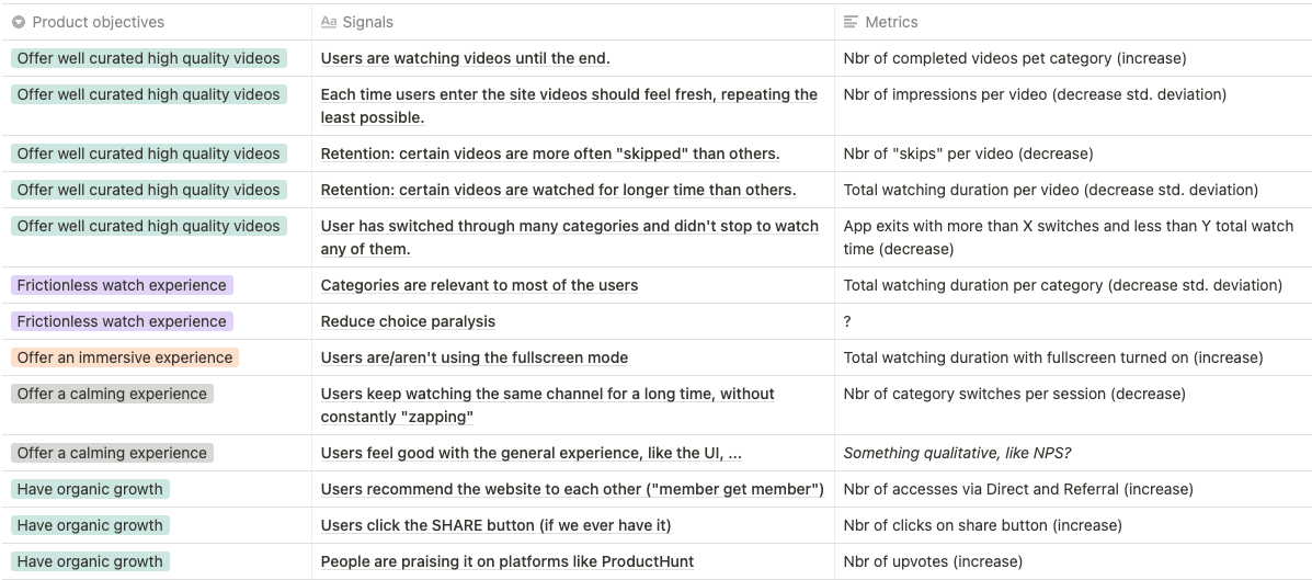
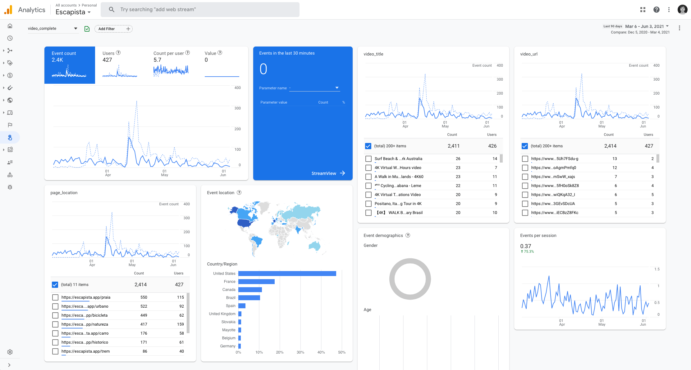
The product metrics were inspired by the HEART framework, but instead of using regular dimensions such as Adoption, Engagement, … we used our own product goals as dimensions for thinking and organizing the different signals and metrics. These were implemented using the new Google Analytics 4, which has a brand new events system.
To measure the quantitative metrics I’ve implemented custom events in Google Analytics, and this is how the dashboard looks like.
From the qualitative side we also have a Typeform survey embedded on the website that makes it very easy for users to leave feedbacks about their experience.
Results
Media coverage
Since the ProductHunt launch we continue being marketed organically by news platforms, blogs, websites and on Social Media in general. For a non-profit project like this one it’s great not having to spend any dollar in marketing.
Numbers
We’re quite happy with the amount of hours people have spend on the website, which corresponds to more than 100 entire days watching Slow TV videos!
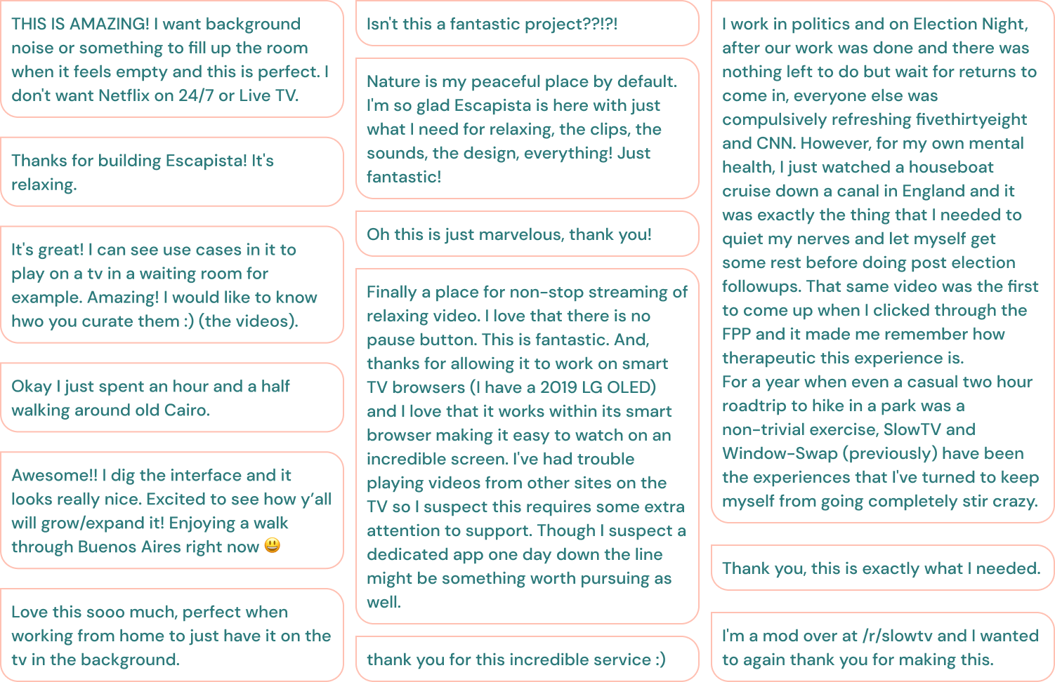
Testimonials
And, of course, we’re utterly happy with the several heart-warming user feedbacks we received already.
This case study leveraged generative AI technologies to help extract key insights from years of extensive project documentation I created. It also helped me suggesting improvements to the writing. All AI-generated content was thoroughly reviewed and manually edited before publishing.
See more
"Computers are like a bicycle for the mind."
