Meu Corre
Timeline
Roles
Team
Overview
Meu Corre (“My Gig”) is a social impact entrepreneurship project I co-founded with Igor Dalla Vecchia, a PhD candidate studying on the relationship of Brazilian courier workers with platforms. For over 4 years I led Product, contributing from Discovery, Strategy and Research to UX/UI Design and major technical decisions.
We successfully got funded with more than R$ 200k (~€33k) by FAPERJ, CNPq, and Fundo Brasil, important Brazilian research institutions, and gained access to 2 years of mentorship and workshops on Business and Product Management. This allowed us to successfully launch the app on Google Play in April/2024 and we have been iterating on it with user feedbacks while planning on next steps.

Working on Meu Corre was one of those projects that really stuck with me. It pushed me to step out of my bubble, partner with so many different people, listen without judgment, and rethink what really impactful “solutions” actually look like.
Problem statement
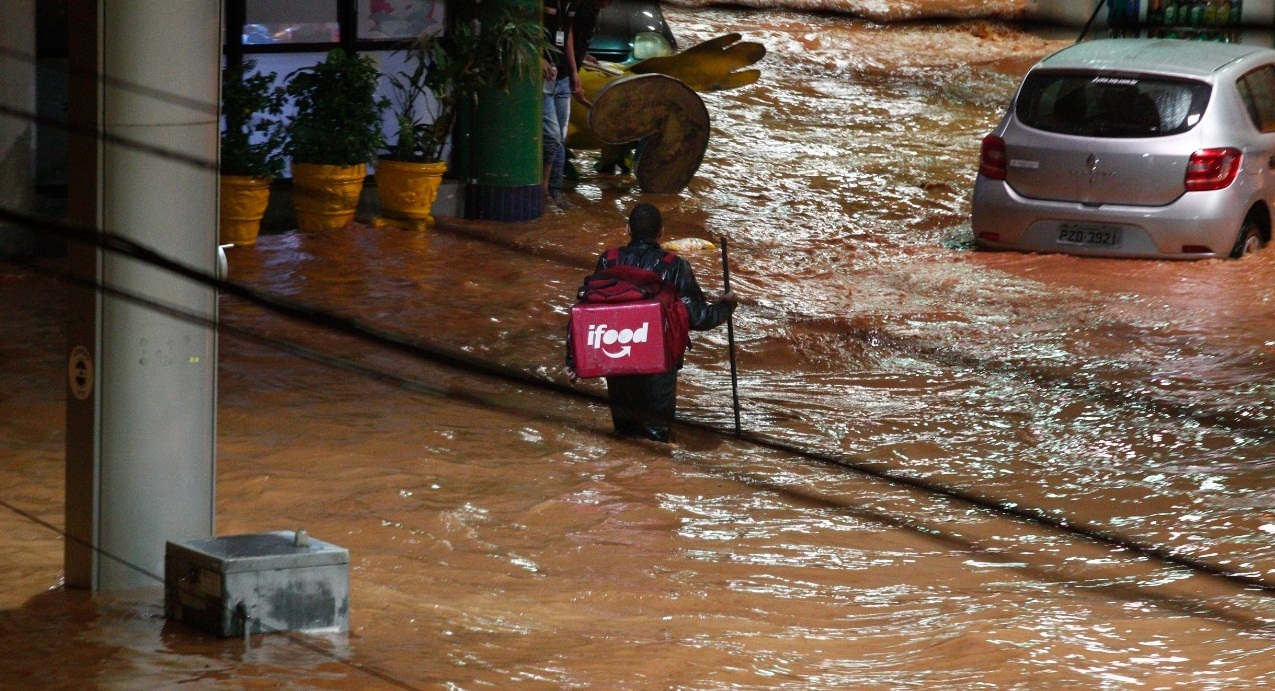
The project was born out of our desire to build a tool to help address the challenges faced by delivery workers in Brazil. The idea initially emerged before the pandemic but gained momentum during it when delivery workers played a vital role in helping people stay at home while they were out on the streets, often in precarious conditions.
Delivery platforms often attract workers with promises of flexibility and entrepreneurship. However, the reality is much harsher, involving operational costs, financial unpredictability, lack of work rights and time for personal organization, not to mention serious health risks.
Research
The project followed a user-centered design methodology since the beginning. Igor had been collecting data from social media interactions, from community posts in Facebook to chat groups in WhatsApp. This helped him notice the first patterns and draft hypothesis we would build upon.
Getting closer, even if far away
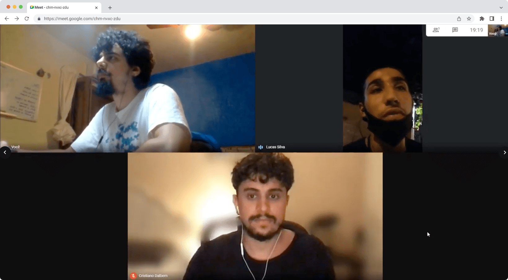
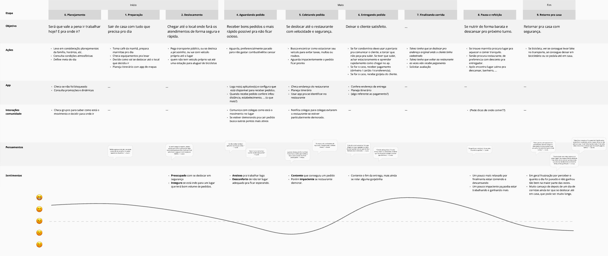
Right after joining the project I planned and conducted in-depth interviews with delivery workers from across Brazil to deepen that understanding. Our sample included both bicycle and motorcycle riders from different regions of the country, ages and genders. We wanted to have a clear picture of how a typical day for them looks like, and we focused on the challenges they faced. We also tried to understand their networks, consumption of content related to delivery, and their financial organization. Finally, we invited them to zoom out and understand how they got there and what were their medium and long term goals.
In some cases their lives were so rushed that they joined our meetings in the street, in the middle between one delivery and another. We made sure the time they spent with us was fairly compensated.
From these interviews we found out that their main pain points were:
- Financial instability: they suffer from a high unpredictability with their financial lives. Their work has invisible operating costs: gas, maintenance, food, cell phone plan, insurance, etc. Without knowing, they’re working as small companies but without the tools to support it.
- Limited financial organization: At the same time, some do have some financial organization, like tracking daily/weekly earning goals in pen and paper or simple spreadsheets, but they lack consistency and often forget to consider these costs.
- Lack of support and fake promises: there’s a total lack of structure for these workers - if it weren’t for their strong sense of camaraderie, they’d be left all alone. They’re sold the idea of being entrepreneurs, but without any training for that. At the time of those interviews, the platforms didn’t provide any equipment or facilities, and workers have to depend on public infrastructure (which is quite lacking in most Brazilian cities) or on the good-will of the private sector.
- Rushed routines: their lives are extremely rushed, from having to take care of their families, long commutes to distant parts of the city where there’s more activity with delivery apps. At the same time, they often have to wait long times for restaurants to prepare the food and for the clients to pick it up. This leaves them without time to study or search for alternatives.
Zooming out to zoom in
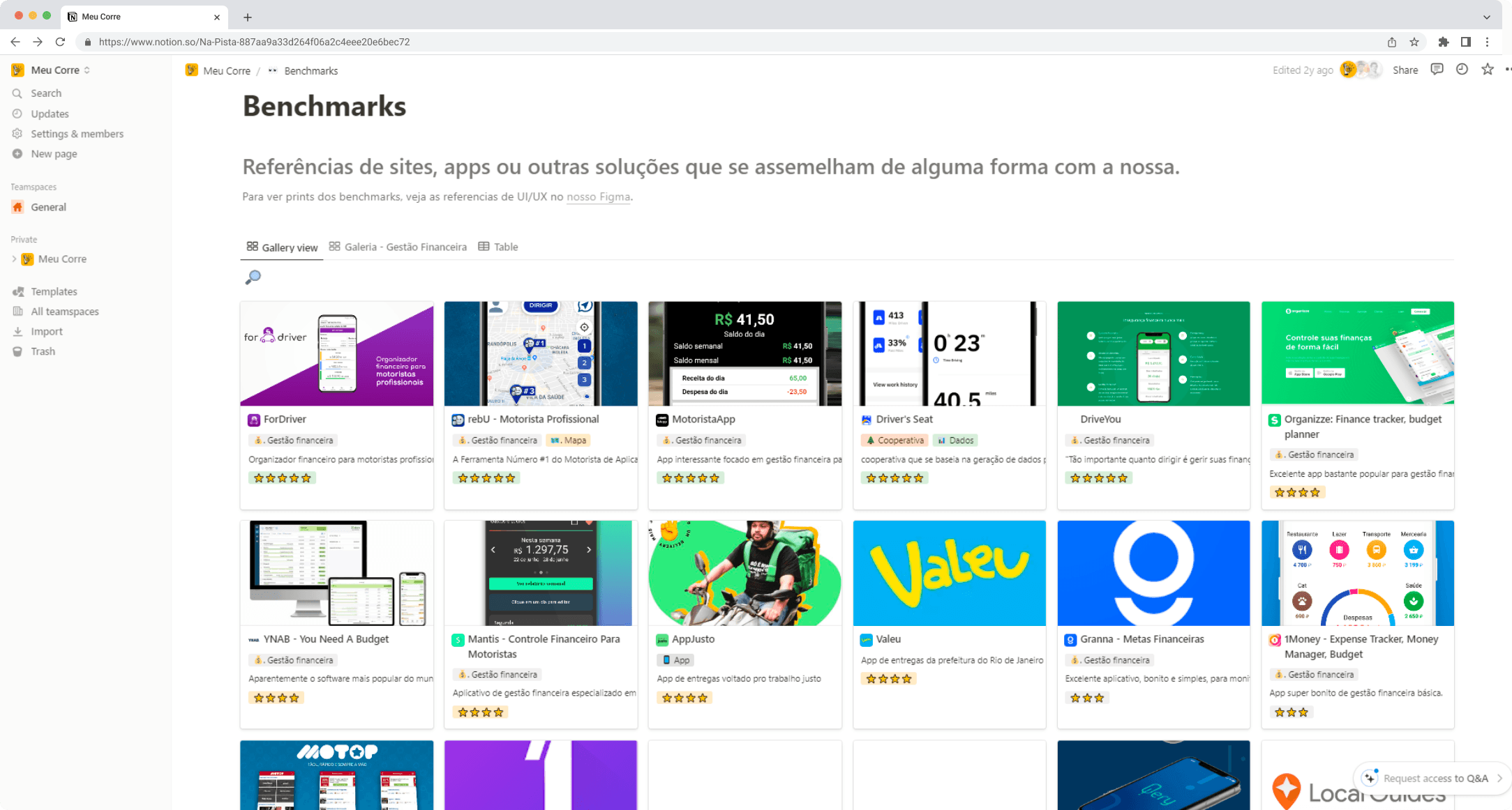
To build a strong foundation, I took the opportunity to look around at what kind of apps these workers were using to support their work: maps apps, financial organization apps, social networks, etc.
I also took a close look at how the platform apps looked like. Even if we’re clearly not in the business of creating competition, these apps is our users’ universe and it was important we understand this shared vocabulary, both visual (how do they look? what kind of interaction patterns are most common?) and textual (what terms they use? how’s the tone of voice?). Often the worker’s-side app was completely different from the consumer-side app.
Exploring solutions
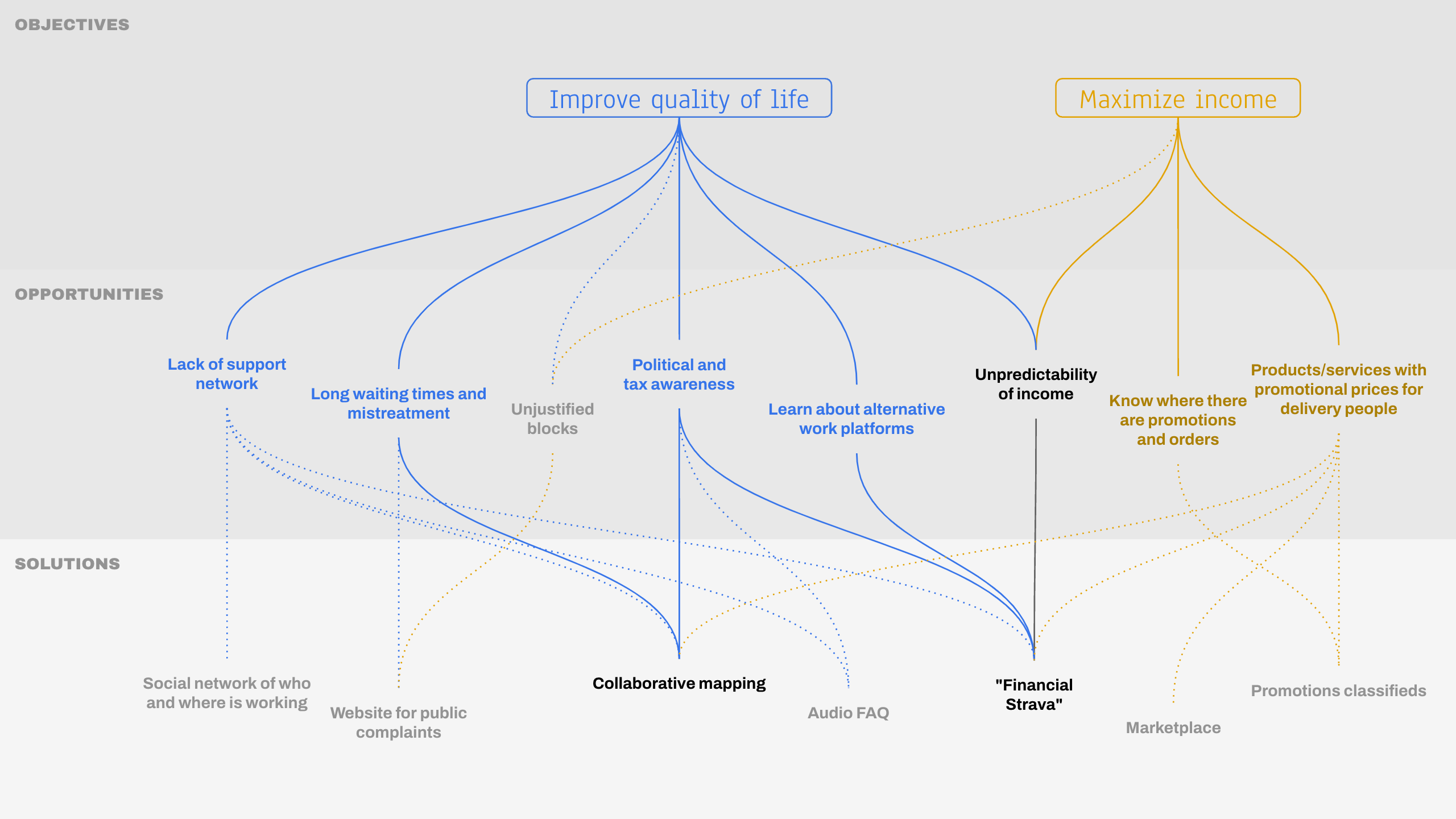
With the vast amount of data we gathered up to this point, I helped the team summarize all our findings using the Opportunity Solution Tree diagram. From this, we selected a few ideas we though were most promising and I’ve guided through a Design Sprint to better polish the ideas and have something tangible to test with real users.
Design Sprint (but semi-marathon style)
Normally Design Sprints are done in an intense week of work, but since Meu Corre was a sideproject for all of us, I planned a longer version of the process that would last a whole month: each week corresponding to one of the days of the Design Sprint 2.0 format popularized by https://ajsmart.com/.
The “Financial Strava” concept
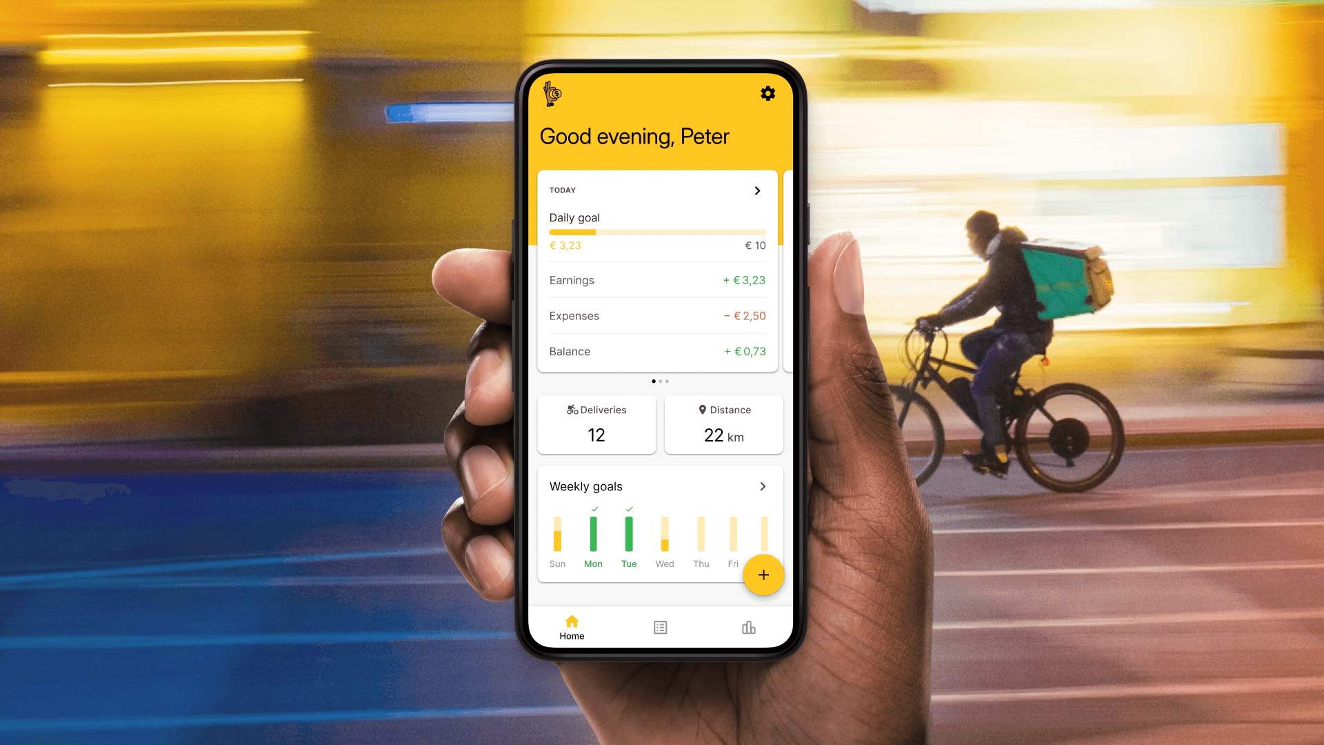
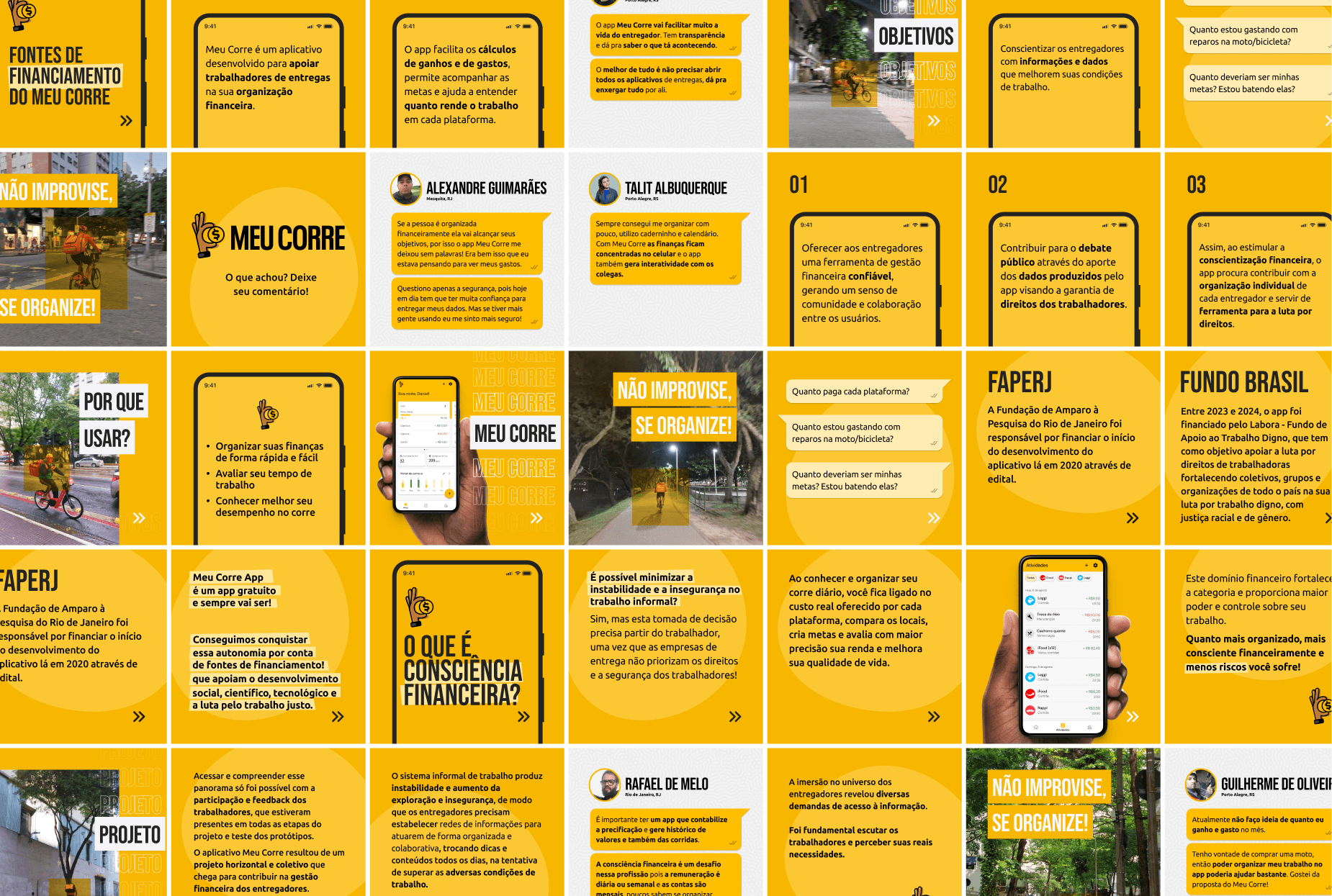
The winner concept was the “Financial Strava”, a kind of app that would merge the popular sports-tracking app Strava with the specificities of their work as delivery workers. The user would add their earnings and expenses to the app, which would help them track their daily and weekly goals and calculate some personal performance metrics.
What was amazing about this idea was the potential to understand their work at scale, which could be fed back to the workers as dashboards and reports to maximize their earnings: which platforms paid better and what were the best times to work.
The last week of the sprint was dedicated to run users tests with an interactive prototype.
Main insights
A step in financial organization
Recording earnings one by one will not work
Metrics are a big win
Keeping statistics simple
The need for freemium
Building a MVP
Throughout the course of the next year the “Financial Strava” was continuously refined as we talked with more users, closed partnerships, developed business model ideas and started development with a software house we hired.
A highlight during this phase was our participation on the online workshop ‘Health and Workers’ Rights in Times of Digital Platforms’, a partnership with teachers and researchers from the highly influential Brazilian institutions Fundação Oswaldo Cruz (Fiocruz) and DIEESE and the UFRJ and UFF universities. This forum allowed us to deepen our understanding of the users and to expose our ideas to a wider audience.
A familiar visual language
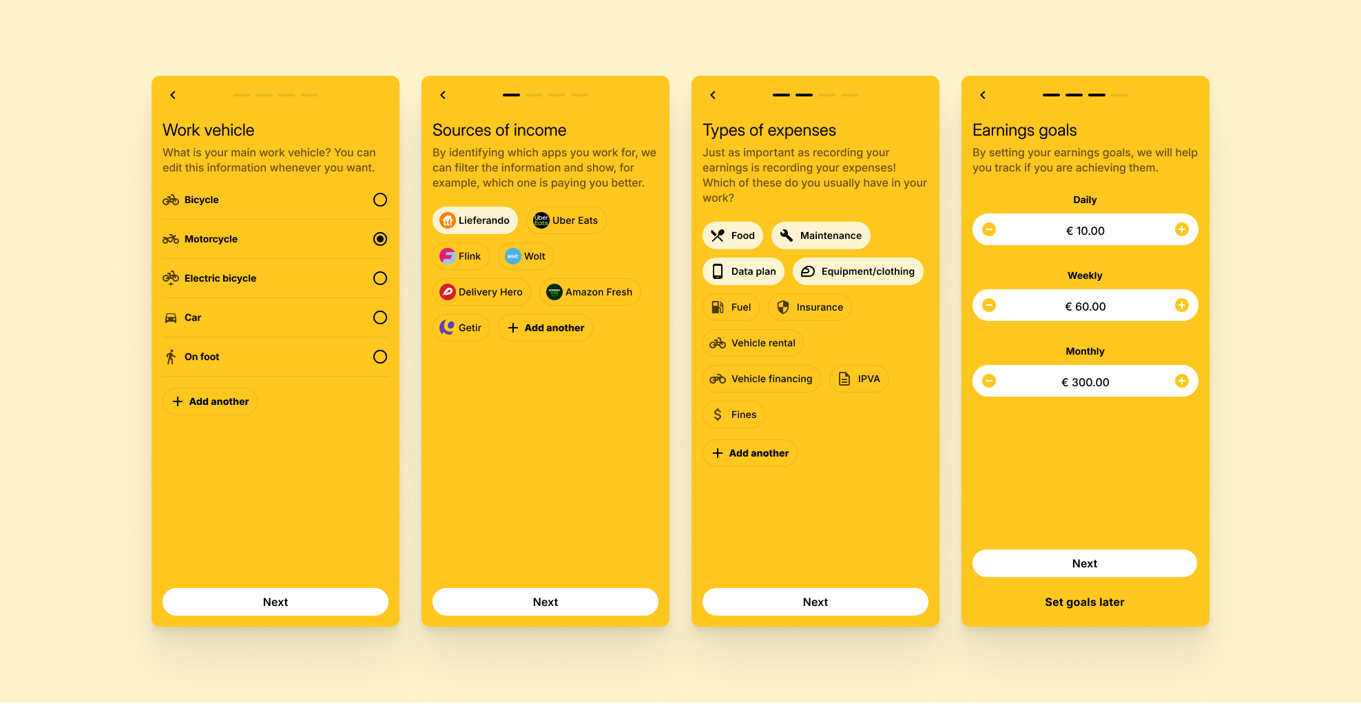
When building the foundations for typography, color palette and visual identity, I wanted to make sure the app would engage with our users, who have limited formal education and experience with technology. As low income people in Brazil tend to have Android devices, delivery platforms at that time only made available their app to that ecosystem. For that reason I’ve built the Design System on top of basic Google Material Design components and patterns, achieving a visual language that would be most familiar to that audience.
Teaching the user on the go
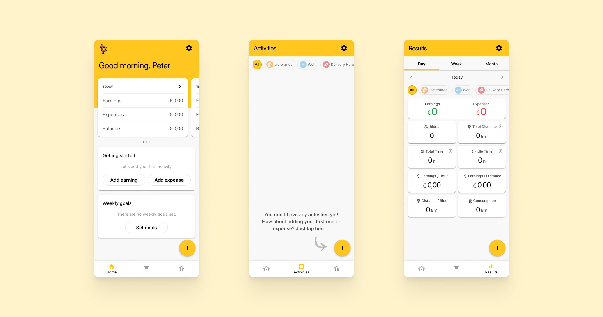
A special attention was given to the first experience of the user with the app. Instead of the regular carousel kind of onboarding, which we think ours users with their rushed lives would most likely just skip, we gave extra though to the empty states. Some of our features, while common in the world of financial management apps, they can be very new to our audience.
Simple but customizable
When first signing up, we give the option for the user to customize the experience with what makes sense for them:
- Vehicle: The user can chose one among all mobility modes used by delivery workers. (and yes, although not officially permitted, some do work by foot)
- Sources of income: What platforms do they work for? We prepopulate with all the most popular platforms, but also enable them to add their own.
- Expenses: Again, we offer a bunch of default options for common expenses they might find in their work, but they can also add custom ones.
- Goals: One of the highlights of the app and a brilliant insight the team had from the research, we allow users to track their goals, a very common practice among these workers.
Optimizing the core interaction
A lot of attention was put in the recording of earnings, since this would be the core activity the user need to do to get value from the app. From our research we understood this could be extremely cumbersome if not handled right, so we introduced 2 features:
- Quick add: for the small, quick earnings of every day, a small modal allows to add it with very few taps.
- Multiple earnings: for the users who like settling their finances in the end of a period like a day or a week, we allow them to add multiple earnings at the same time by just inputting the totals and how many there were.
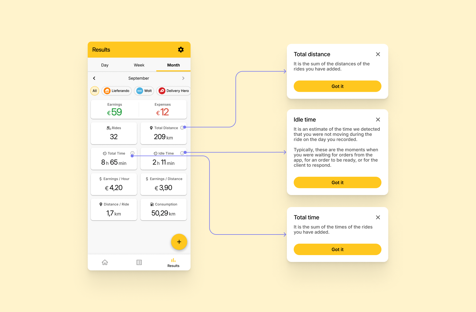
Insightful but approachable metrics
From our learnings from research, we knew we had to be light on the dashboard, balancing insightful but approachable metrics. That’s why we ditched any charts, and focused on metrics some of these workers were already calculating and discussing about among themselves. Some tooltips provided extra explanations for some less obvious ones.
The “Hustle Tracker”
Another solution for automatizing the input of data into the app, the geotracking feature tracks the users’ daily rides and automatically identifies the wasted idle time. This allows users to gain a clearer picture of how much time is spent actively working versus waiting, something that we heard is a big pain for them. On the platform side, the anonymized data we collect about their movement in the city provides invaluable insights for advocacy agents and policy makers.
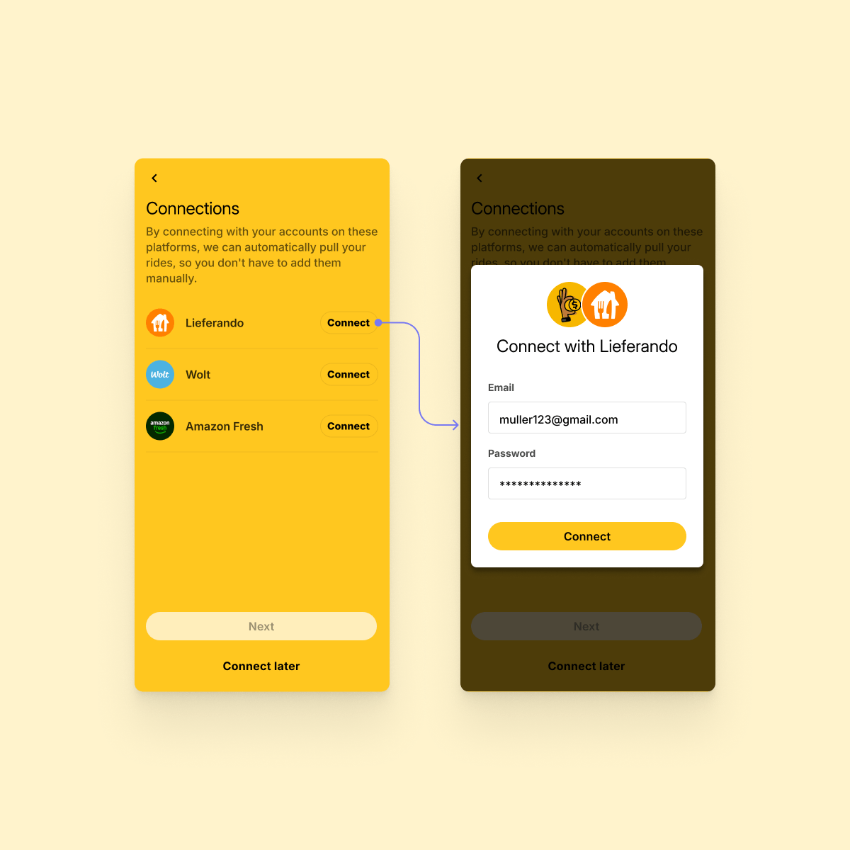
Platforms integrations
Automatically import rides’ data from different delivery platforms. A highly requested feature since the first research, this feature proved to be way too costly for our MVP, but after the launch we’ll seek funding to implement it.
The big launch
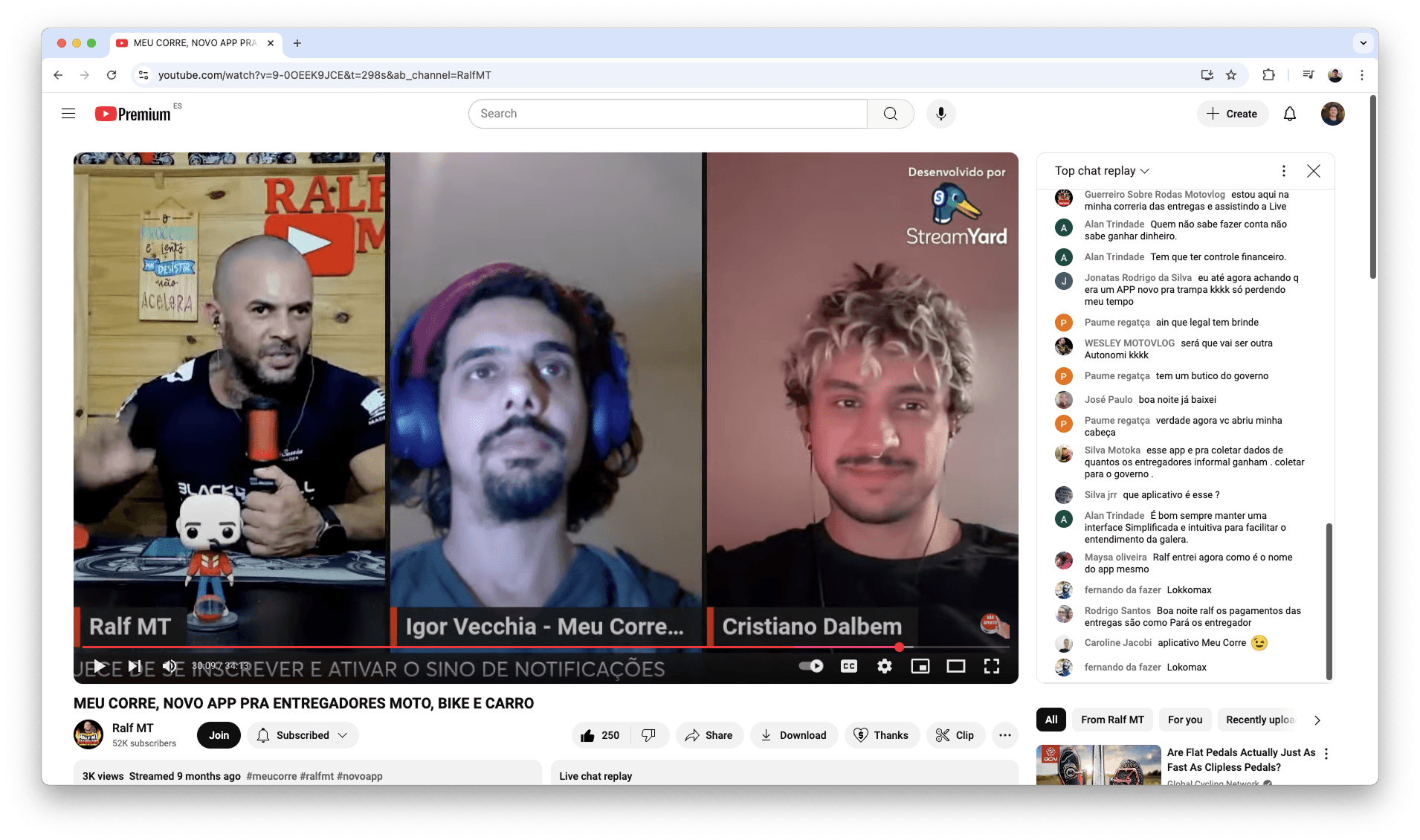
Live events
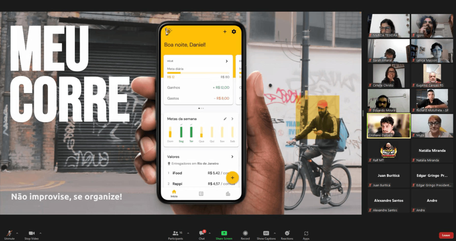
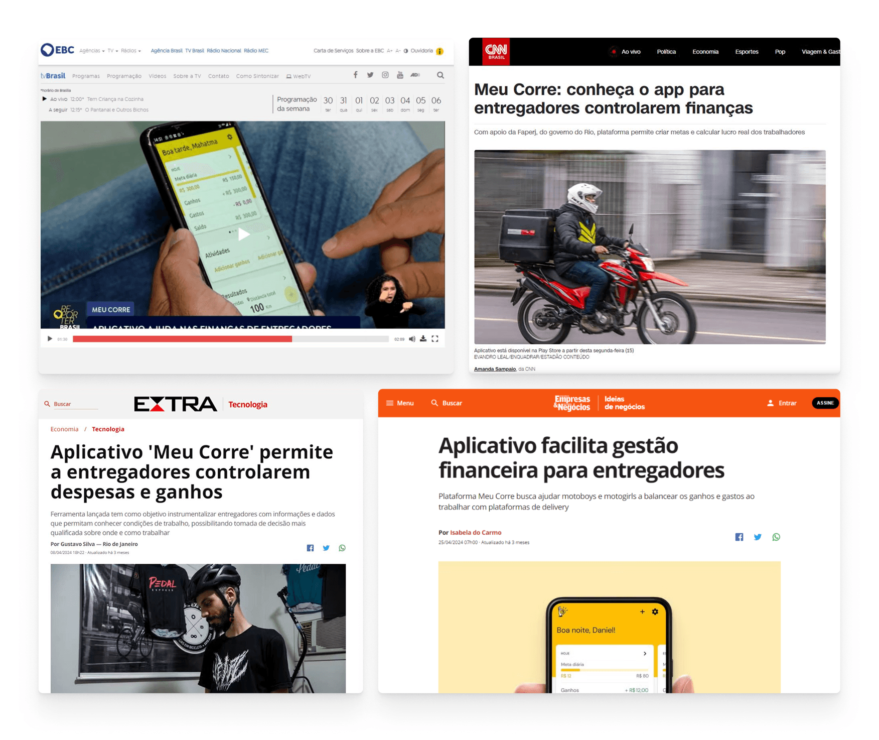
After many years of work, and a [way too] long development phase with thousands of issues, technical challenges and scope prunning, this MVP was successfully launched to the general public with zero known bugs on April of 2024. We coordinated several live events with partner institutions as well as influential workers on YouTube.
Social media
I’ve also helped design our first social media posts, which is always out of my comfort zone, but necessary.
Results and learnings
Here’s a summary of the amazing results we’ve already achieved since the launch in April 2024:
Reception
We’ve been collecting amazing testimonials of people who has been using the app and expressing how it impacted their lives:
The project has also been highlighted in various articles in the media, including important outlets in the country.
Learnings
It’s really hard to summarize here in a few paragraphs how much I’ve learned and grew in almost 4 years of such an intense and different project, but here’s an attempt:
- Challenging assumptions about user needs: Delivery workers’ challenges extend beyond simplistic assumptions about financial instability. Many workers lacked intuitive tools to track their income and expenses, which highlighted the gap between the tech-driven gig economy narrative of “freedom and entrepreneurship” and the daily, often chaotic reality of delivery work.
- Data as empowerment for advocacy: The project reinforced our belief that structured data collection can shift the narrative about gig work from anecdotal complaints to evidence-backed advocacy. By providing delivery workers with actionable insights (such as the true cost of their earnings and platform-specific performance), the project underscored the potential for data-driven conversations about fair compensation, worker protections, and better working conditions.
- Behavioral barriers to financial management: Even when workers recognized the importance of tracking their finances, psychological barriers often prevent consistent habits. Insights from user research revealed the need for ultra-simple interfaces with powerful features that didn’t just rely on rational arguments but tapped into behavioral nudges, such as goal tracking and positive reinforcement. Still, this is a highly complex challenge that even the biggest Fintechs in Brazil haven’t solved yet.
- Otherness over empathy: Involving delivery workers in the testing and design process wasn’t just a “best practice” but a necessity since these were people with social backgrounds drastically different from ours. However, this collaboration presented challenges — balancing worker participation with their demanding schedules required creative approaches and deep respect for their time. Moreover, it highlighted the power imbalances inherent in design discussions and how those needed to be actively mitigated.
- Financial sustainability as a social impact project: Beyond merely securing funding, our experience highlighted how critical it is to position a tool like Meu Corre as a social good solution rather than a profit-driven product, even if going against the will of our initial mentors. Ensuring the app remains accessible and free demands not just partnerships but creative models of sustainability that aligned with our mission to empower gig workers without burdening them financially and, mainly, making sure incentives are aligned.
Conclusion
Working on Meu Corre was one of those projects that really stuck with me. It pushed me to step out of my bubble, partner with so many different people, listen without judgment, and rethink what really impactful “solutions” actually look like. The complete story is full of thousands of twists and challenges I had to skip here - but that’s where the best learning happened. More than just building an app, it was about building something we truly believed in, being full responsible for all of it outcomes, connecting with like-minded (or not) people, understanding their hustle, and figuring out how Design can actually make a difference in their lives.
This case study leveraged generative AI technologies to help extract key insights from years of extensive project documentation I created. It also helped me suggesting improvements to the writing. All AI-generated content was thoroughly reviewed and manually edited before publishing.
Learn more

"Computers are like a bicycle for the mind."